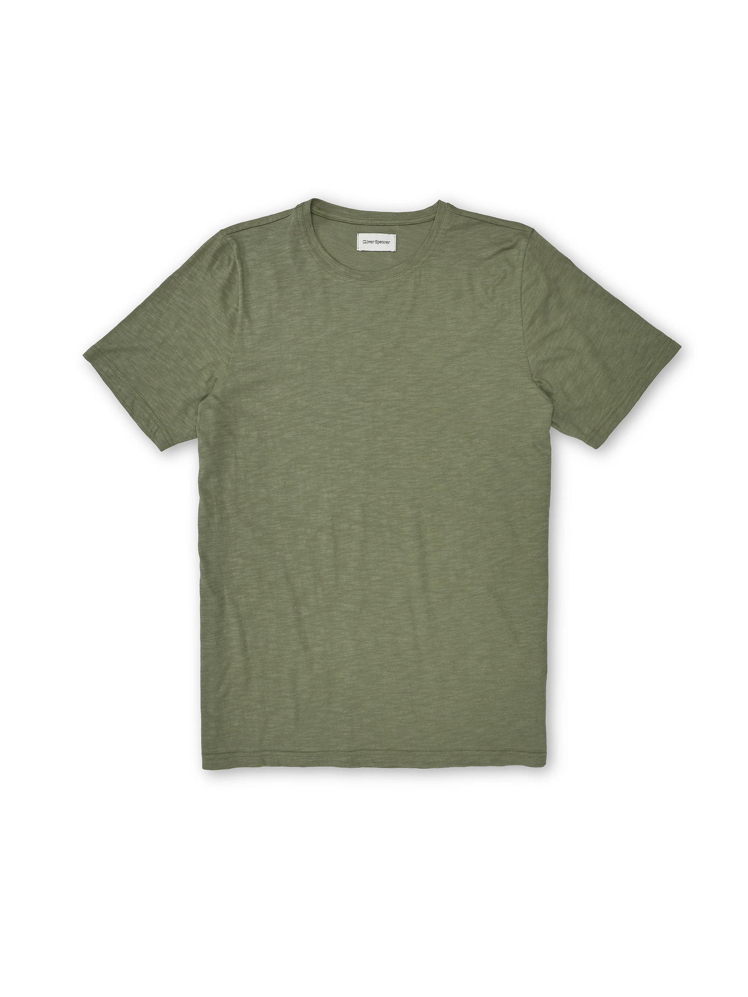
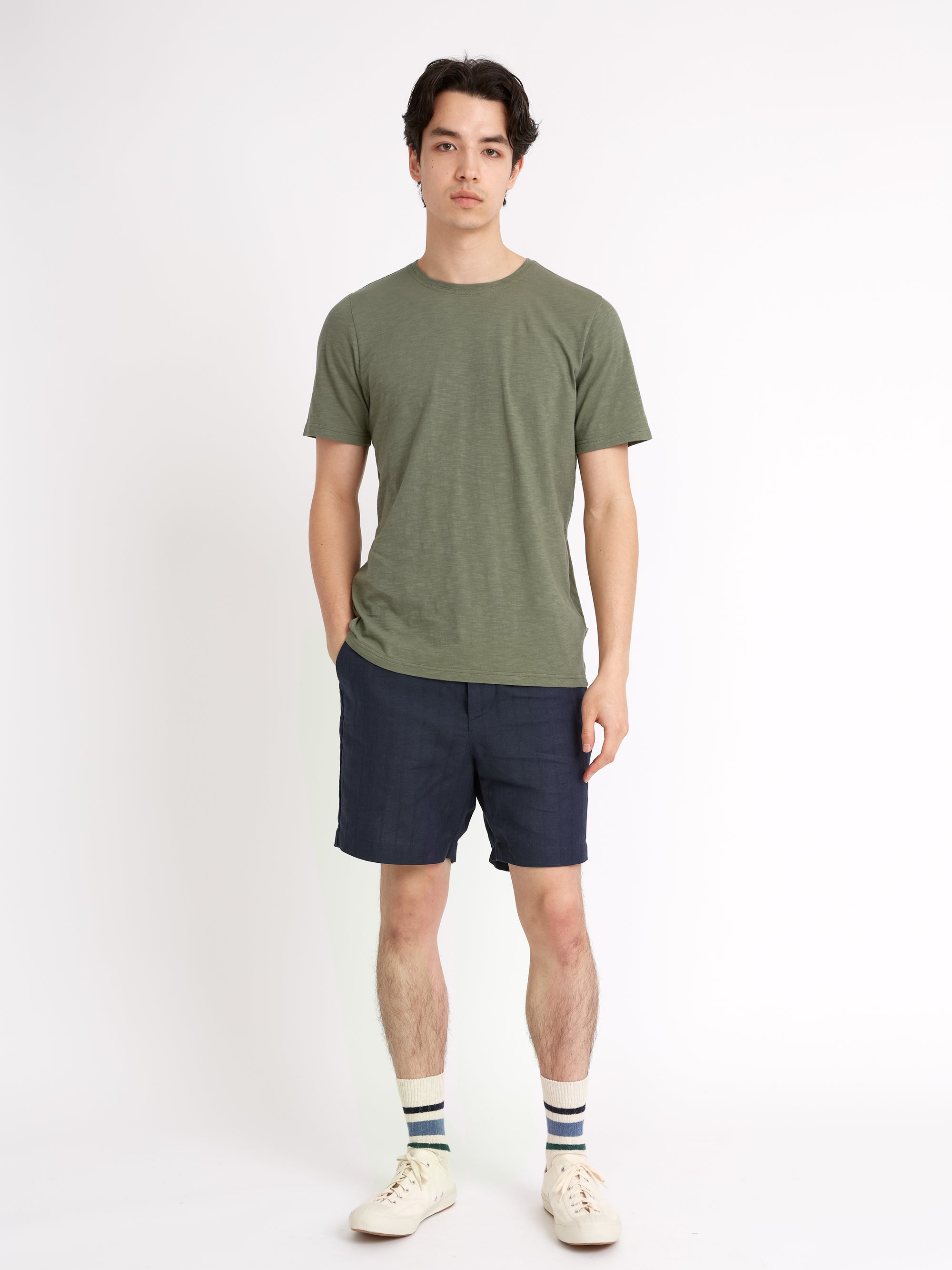
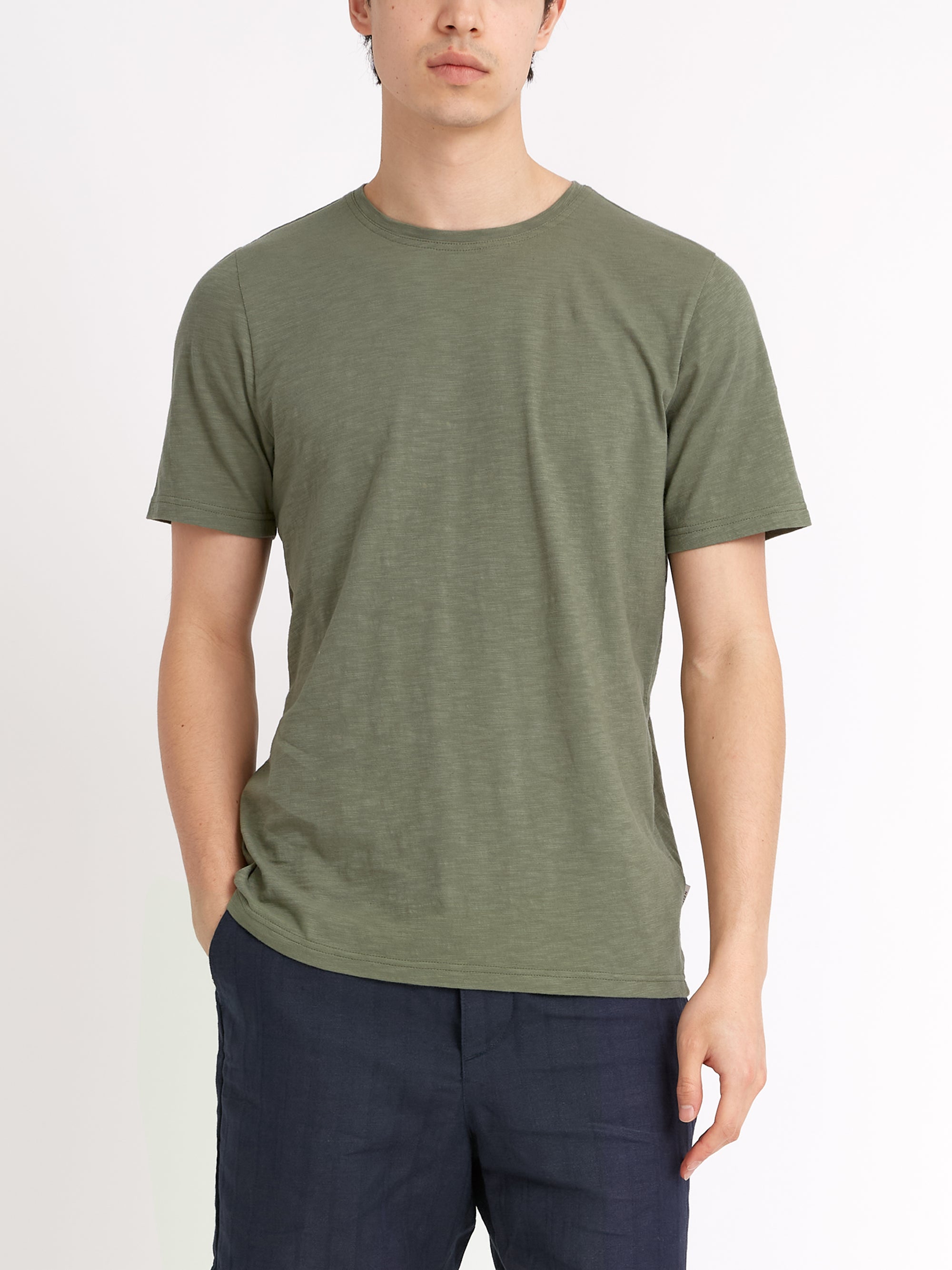
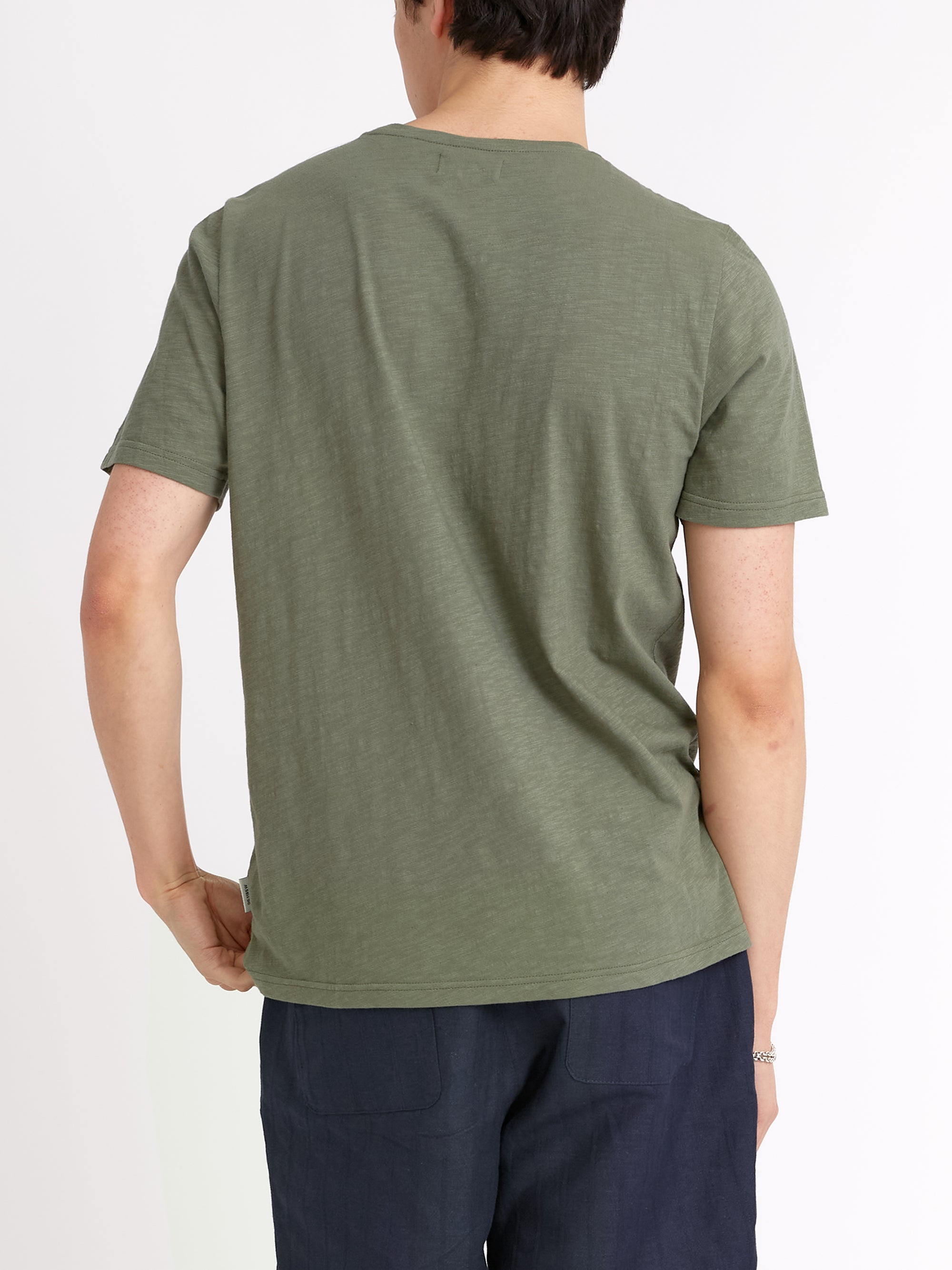
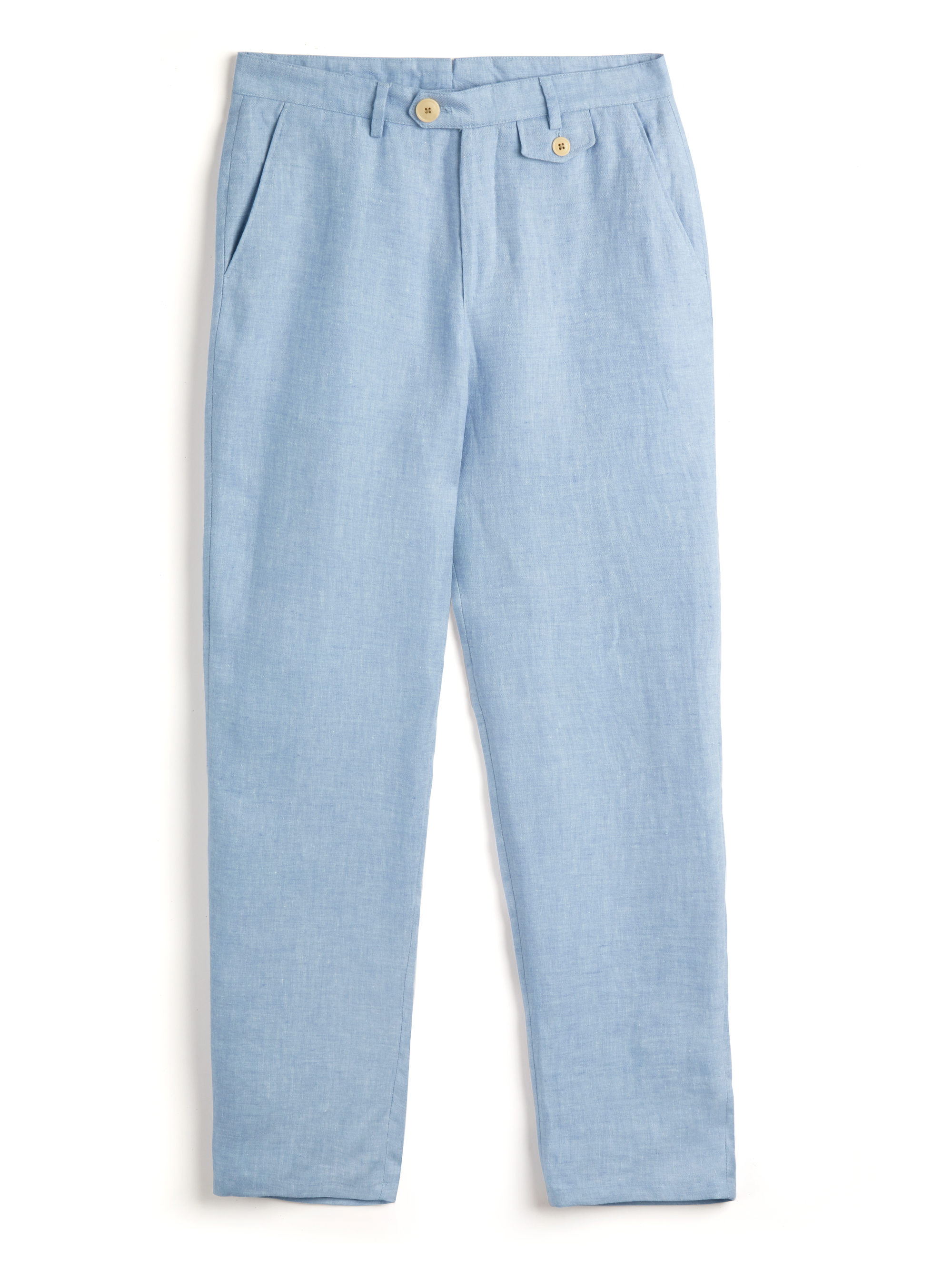
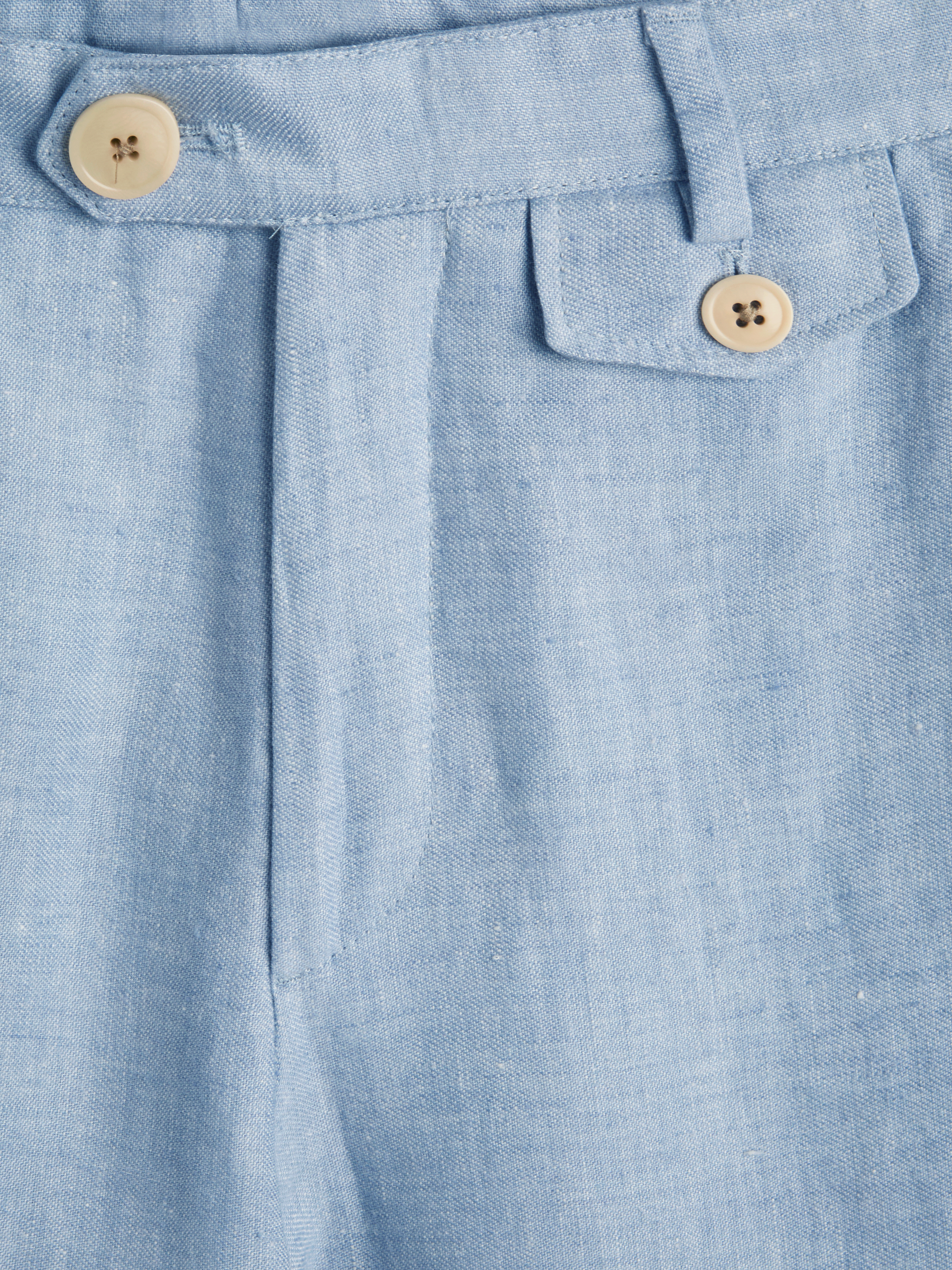
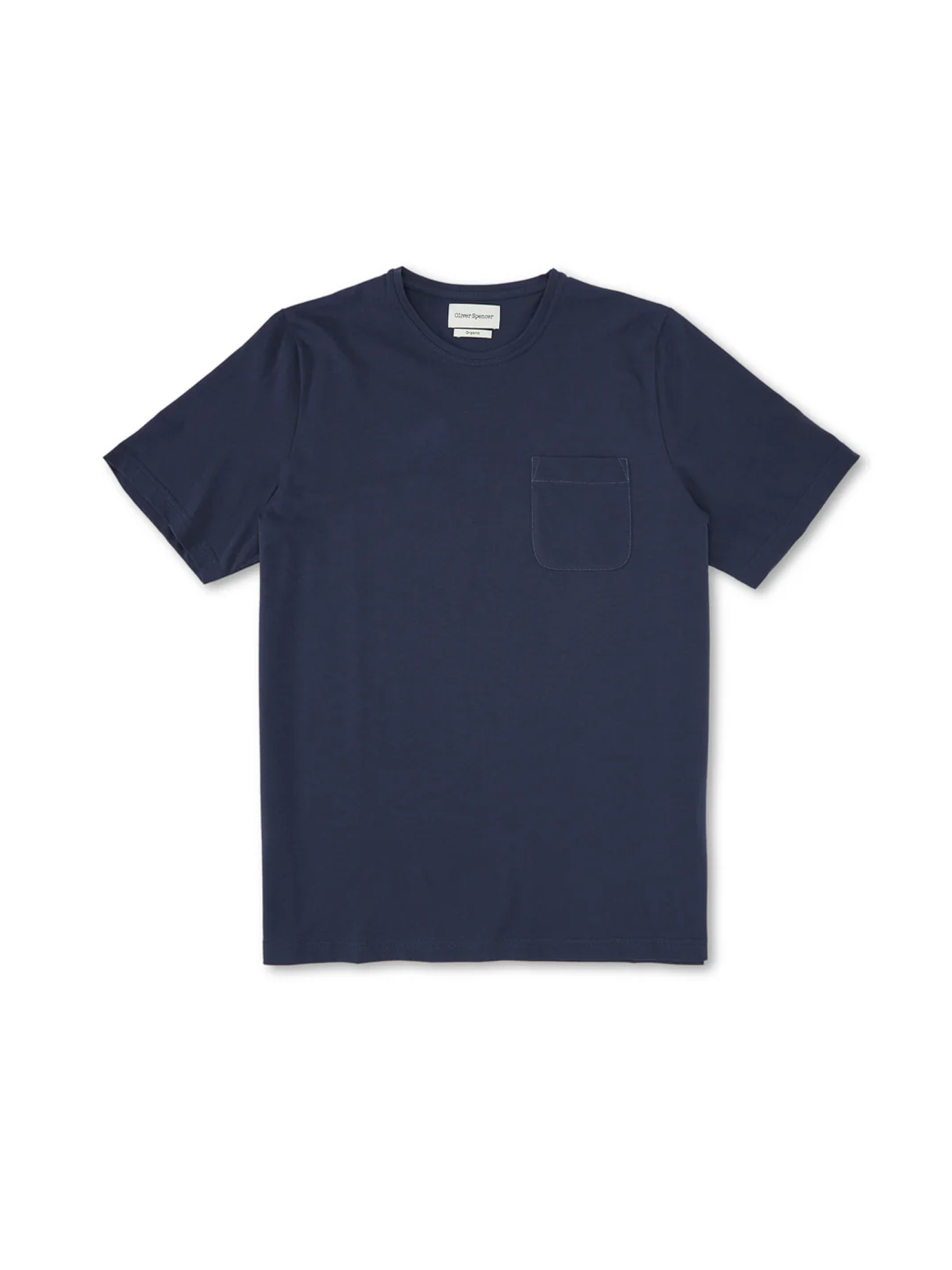
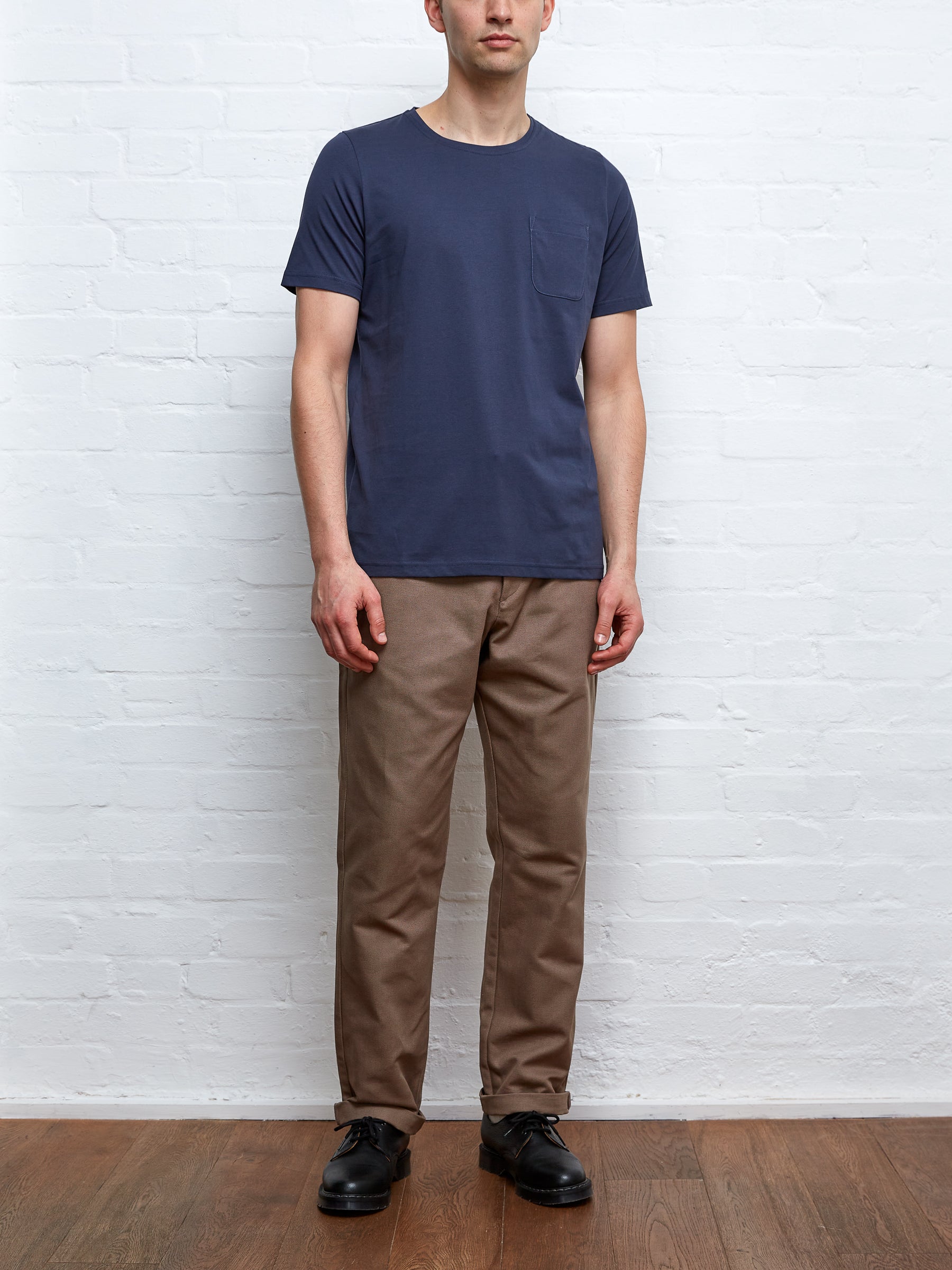
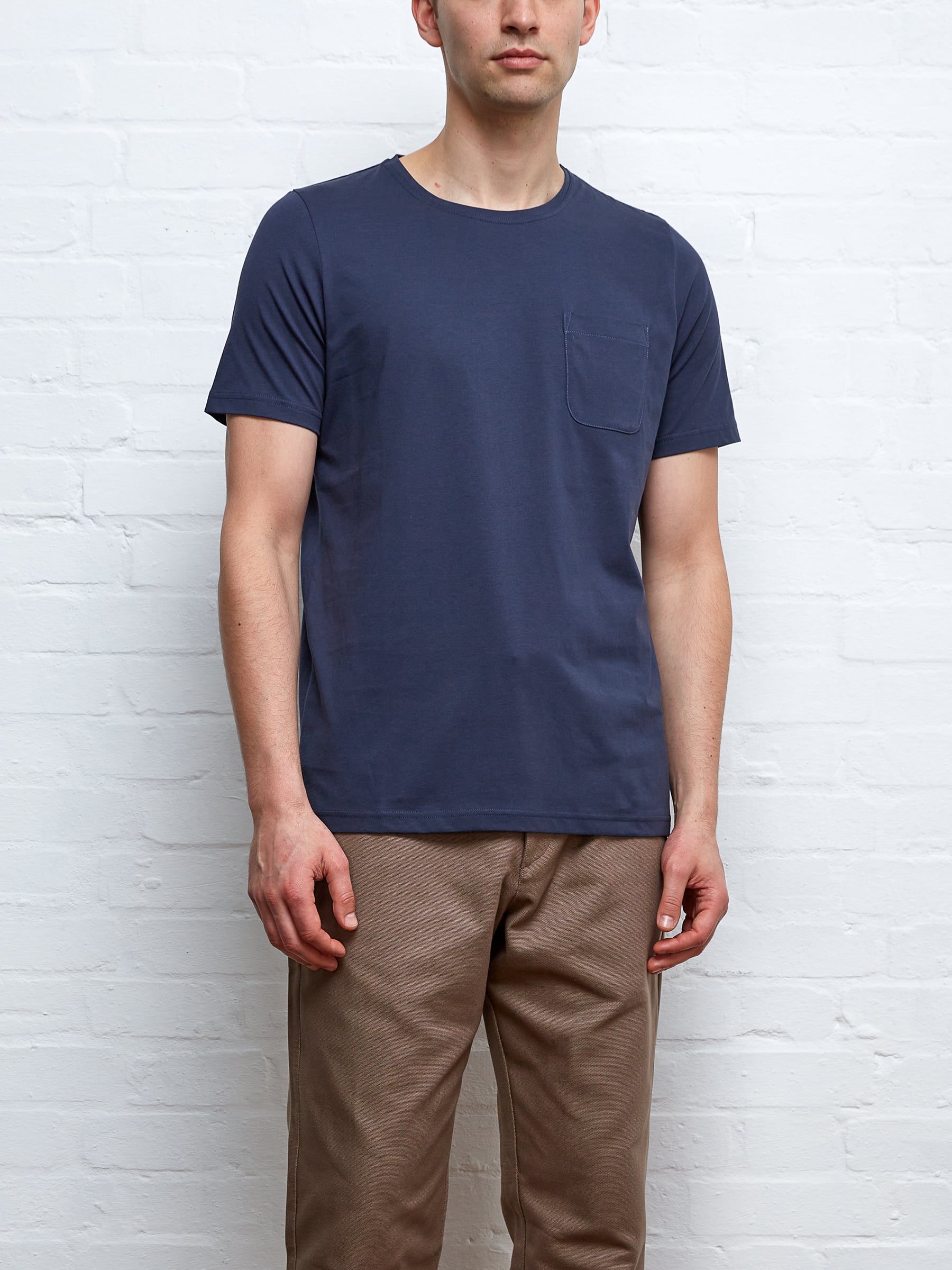
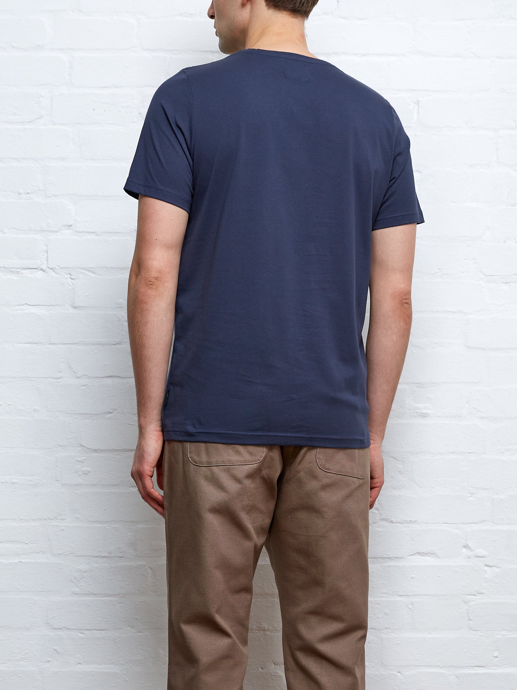
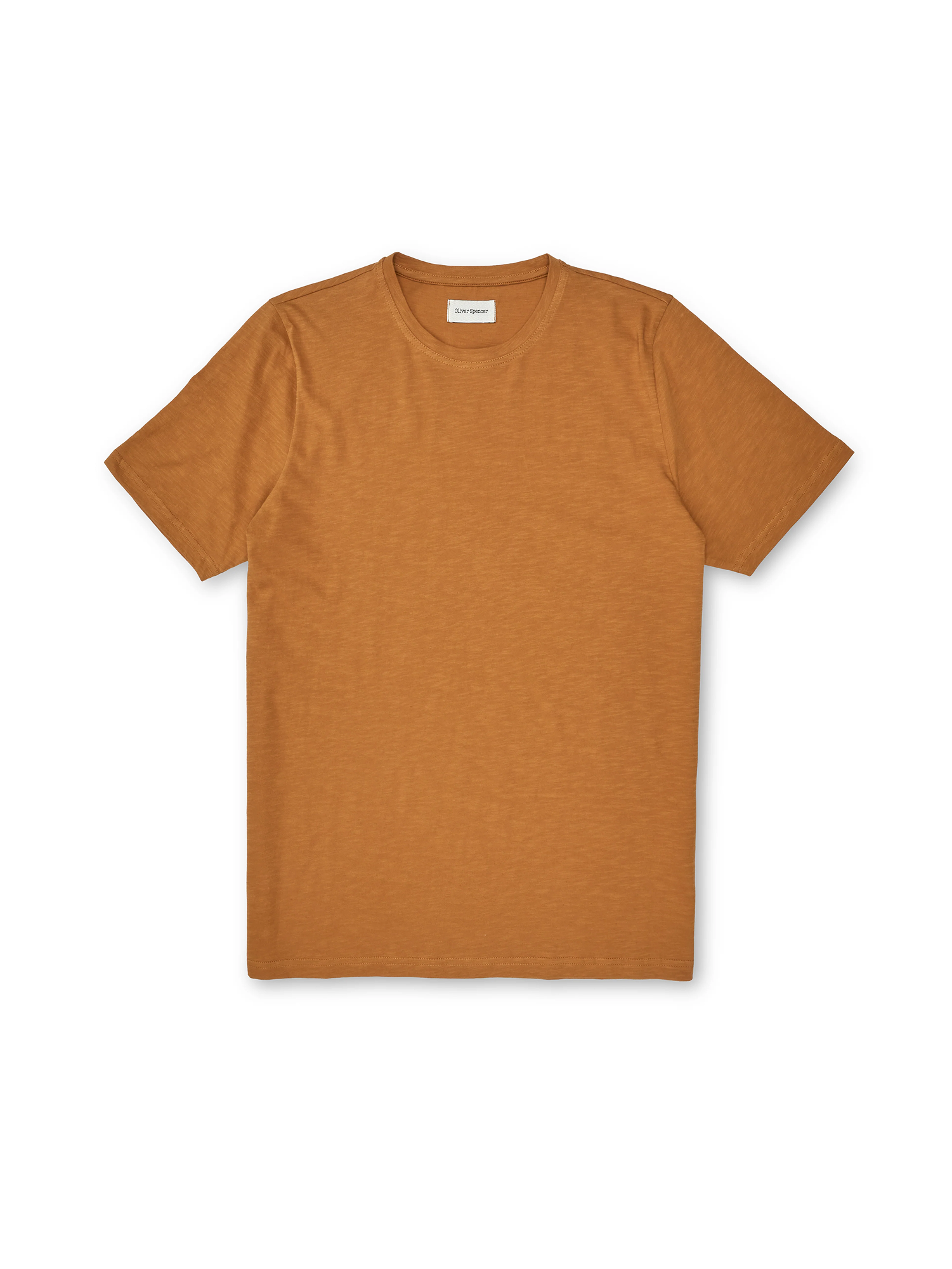
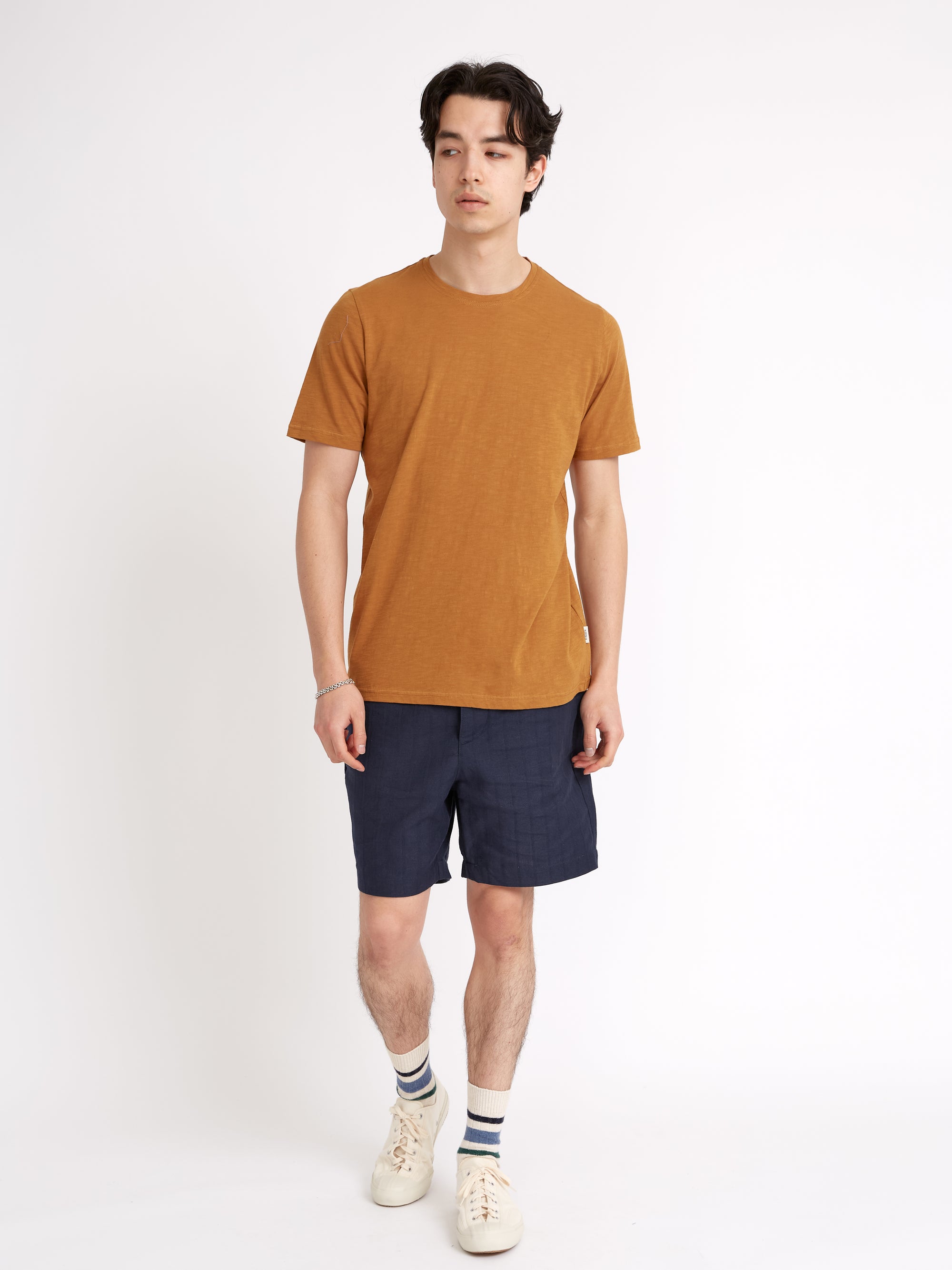
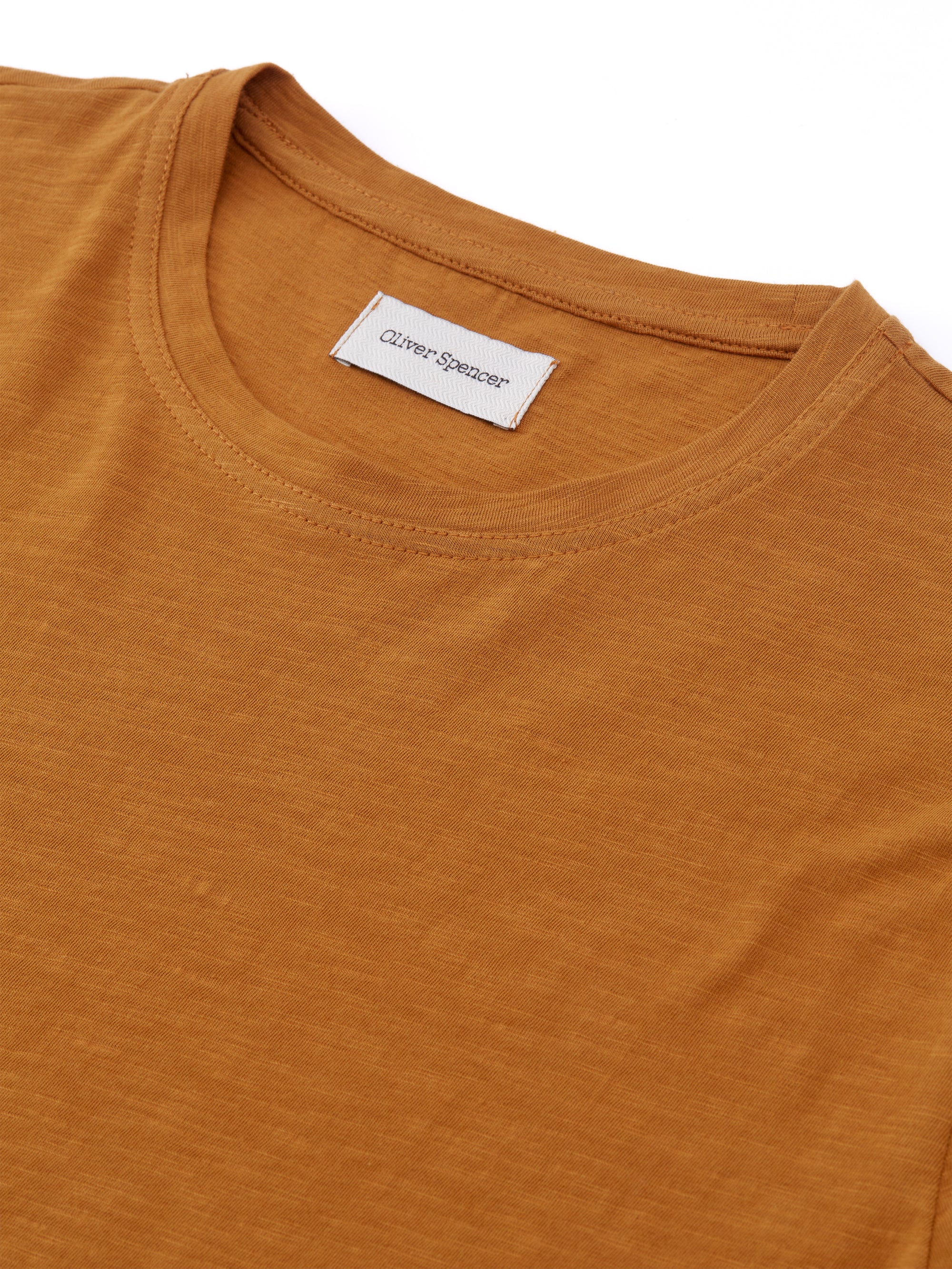
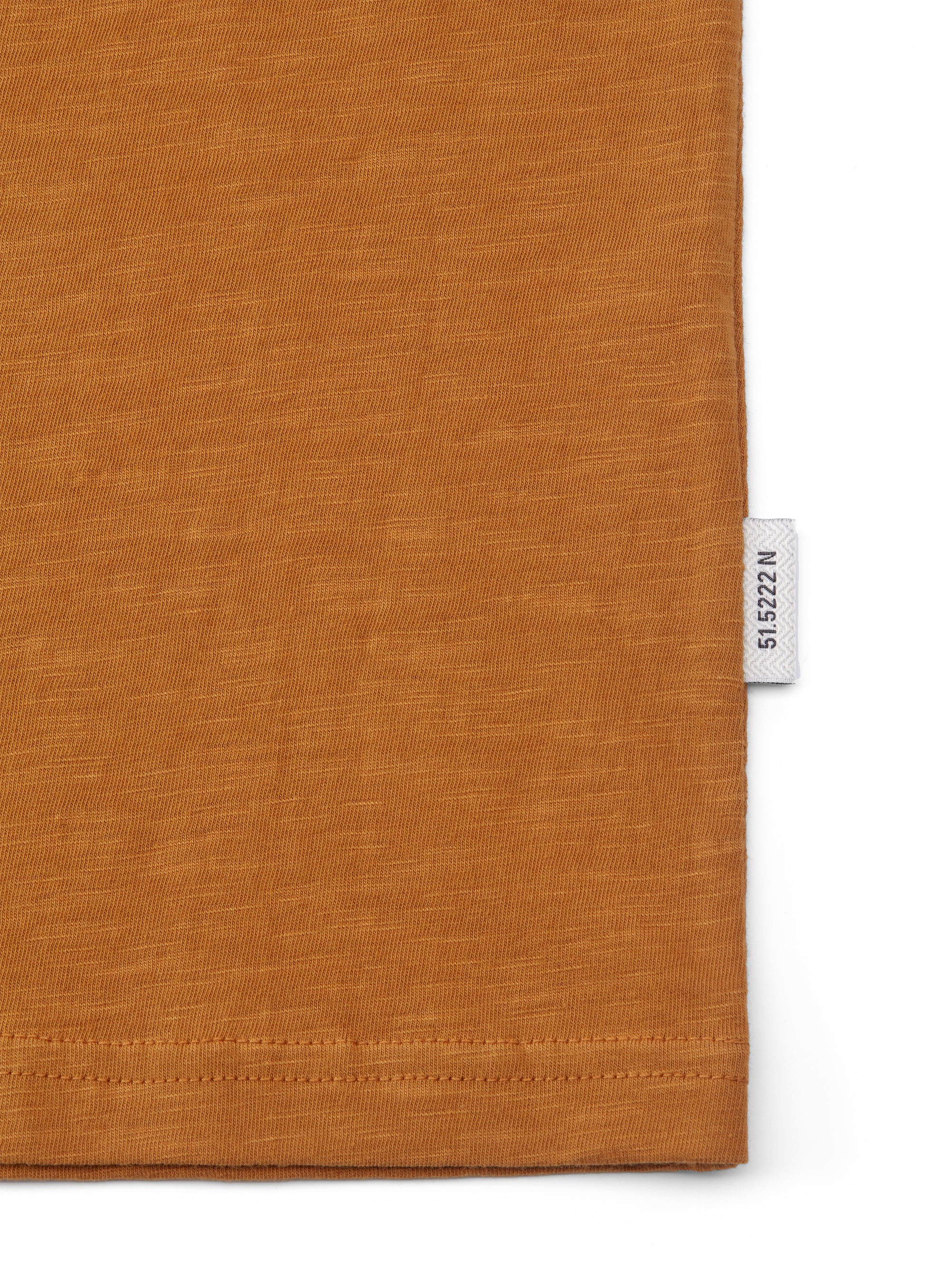
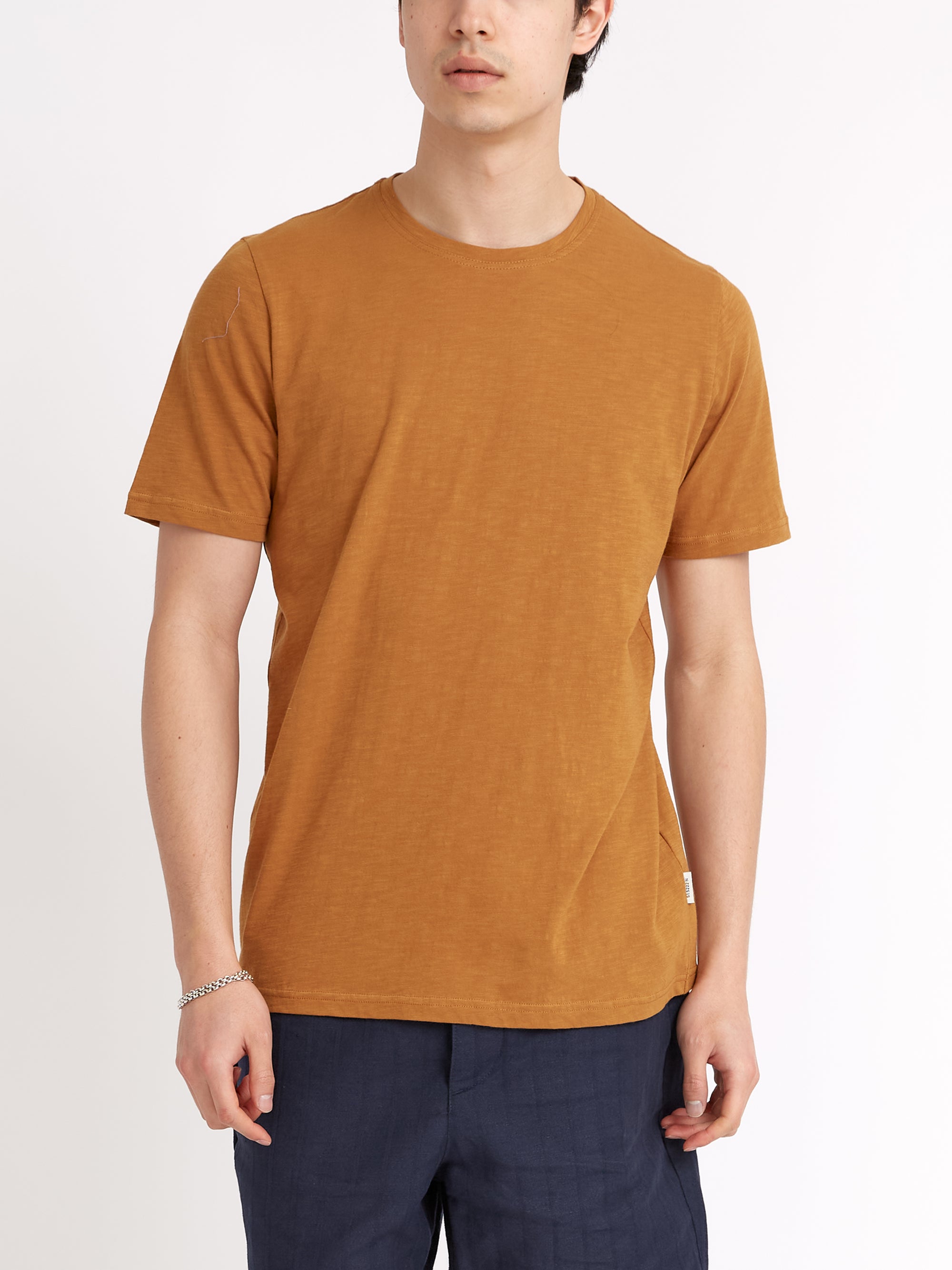
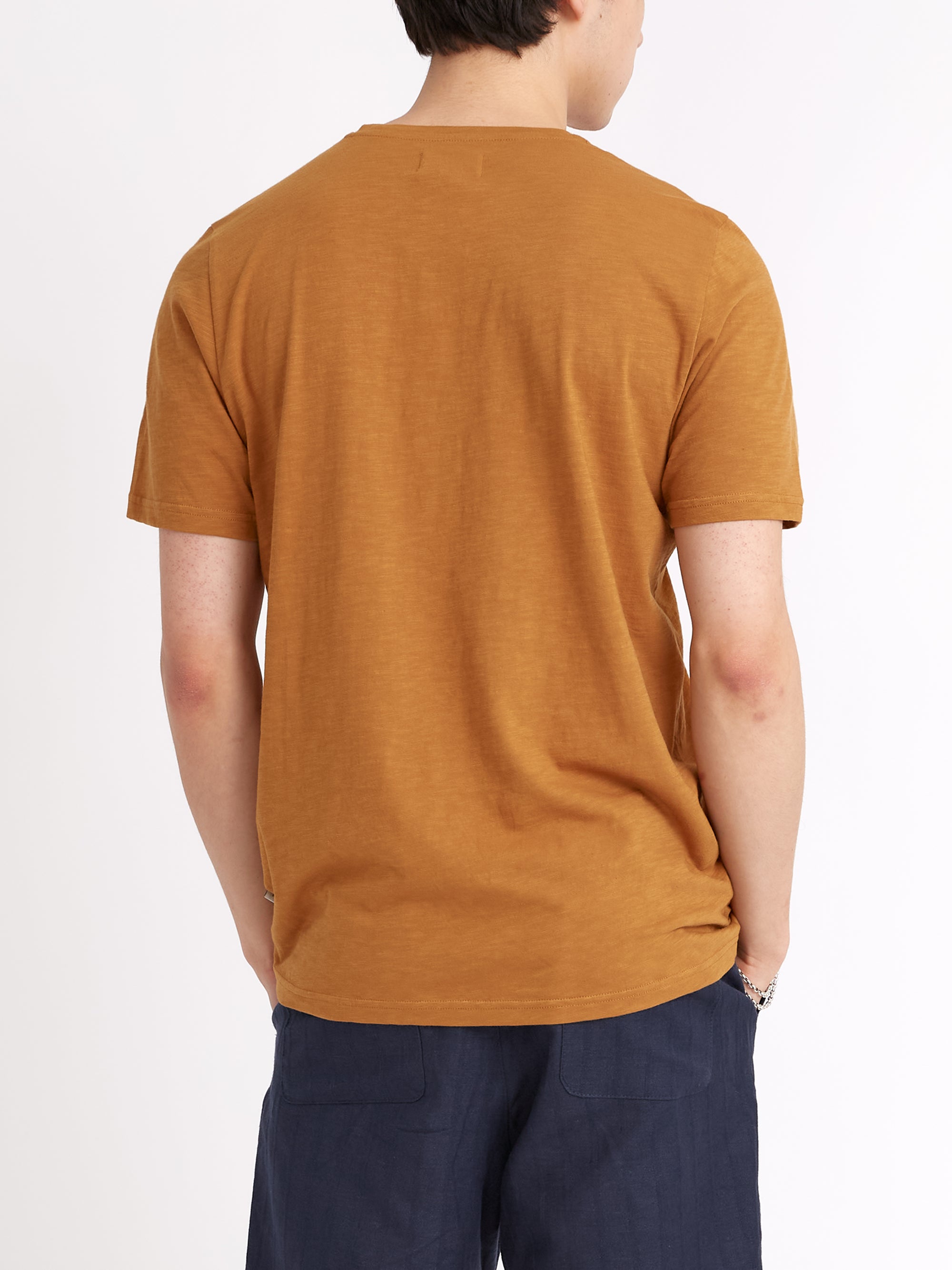
The summer months bring out a whole spectrum of colours that deliver new and exciting styling options. From sage green and cream to mauve and burnt orange, below you'll discover a plethora of seasonal tones to inject life into your seasonal wardrobe.
Colour is of course one of the key levers of great styling, alongside texture and shape, and is without doubt the most visually impactful way to make a statement with your clothing. Or even an understatement for that matter, because colour doesn't have to be bold and brash for people to take note - a monochrome look can be just as eye-catching as a colour-clashed outfit for example.

At Oliver Spencer we create collections with wearability front and centre in our minds, and that's the same modus operandi we use when coming up with a seasonal colour palette. We typically work on a curation of core colours and neutral tones, but then add bolder complementary accents to create a degree of contrast. It's why no matter what sort of menswear genre you subscribe to, our collections will seamlessly integrate into your wardrobe.
Check out some of the key colours we've used in our spring and summer collections this time around...
A Gamut of Greens

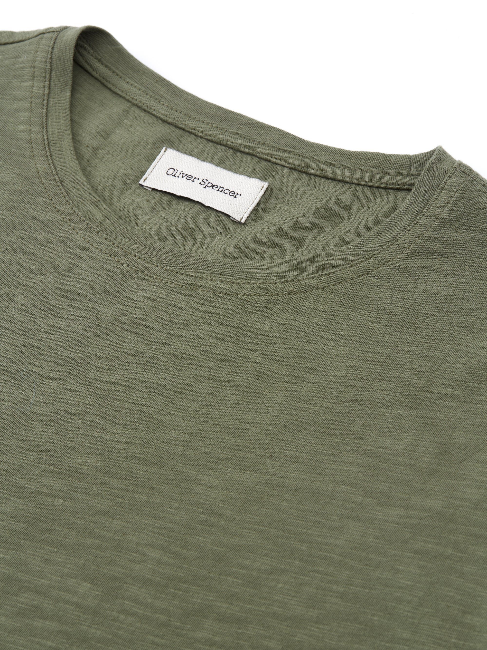
The colour on the spectrum most easily visible to the human eye, green is one of those ubiquitous tones that everyone can wear. With a diverse array of hues, green can be both base colour and accent, but this season we've used quite earthy tones for a soft interpretation of the colour.
