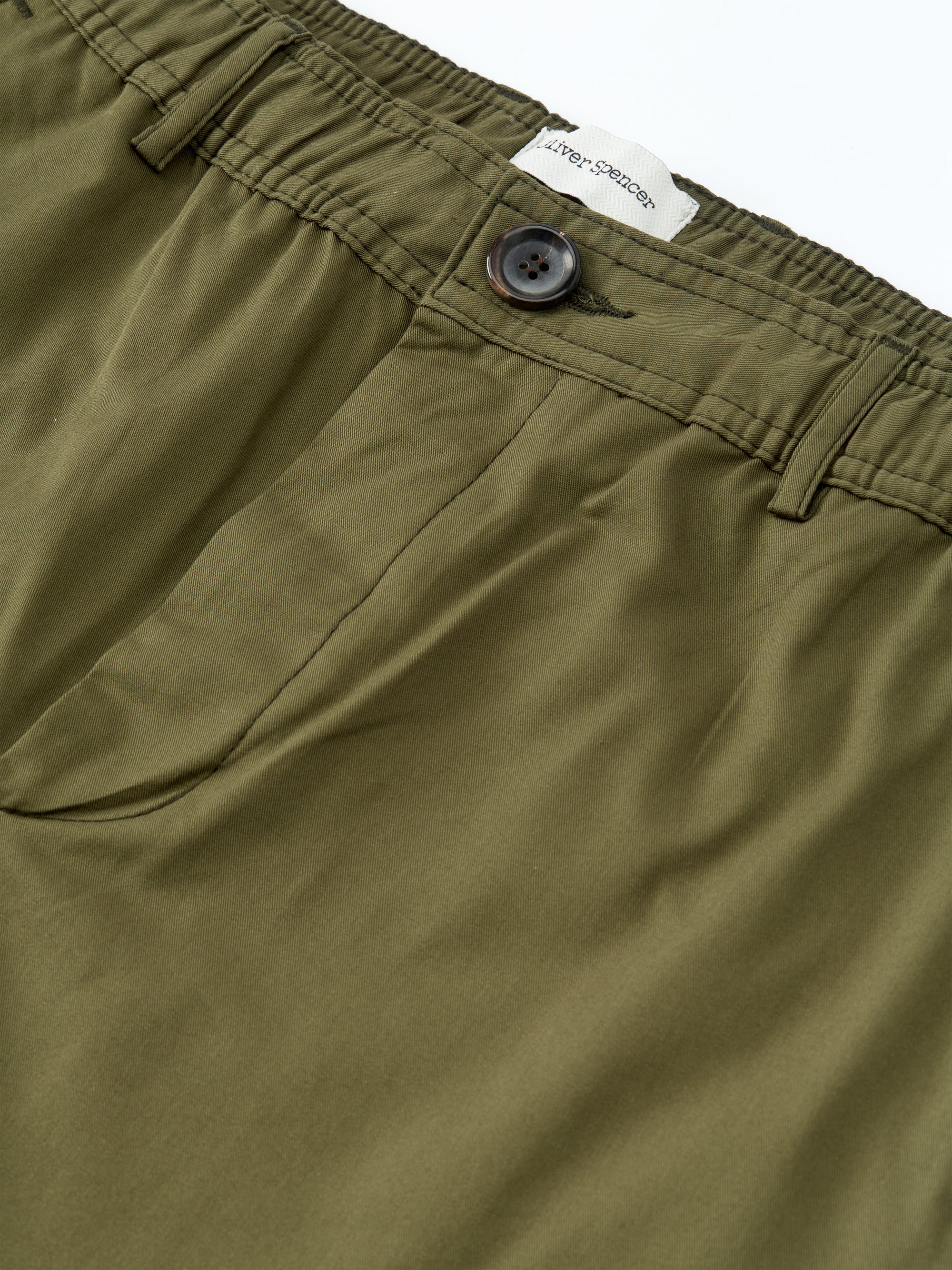
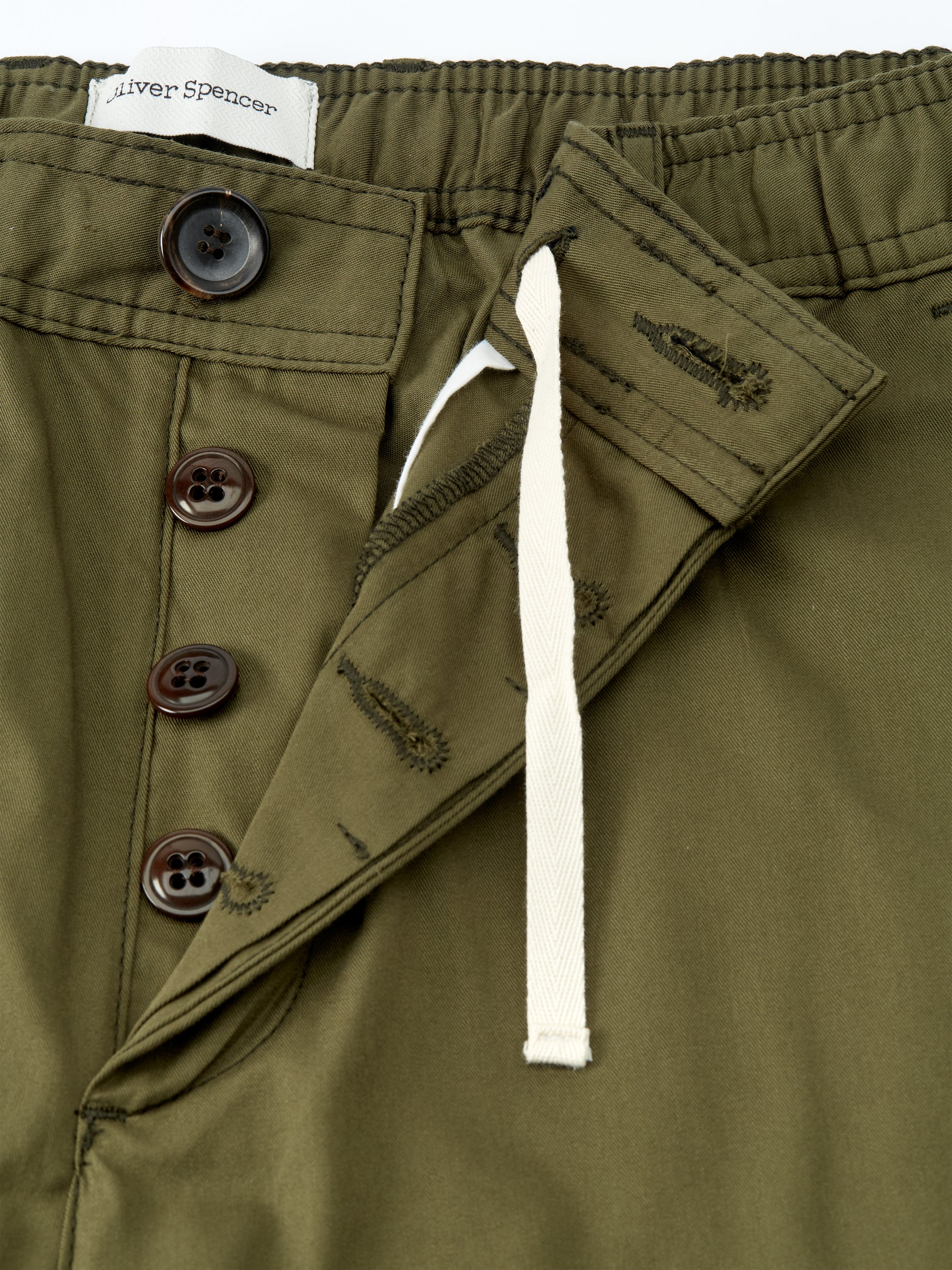
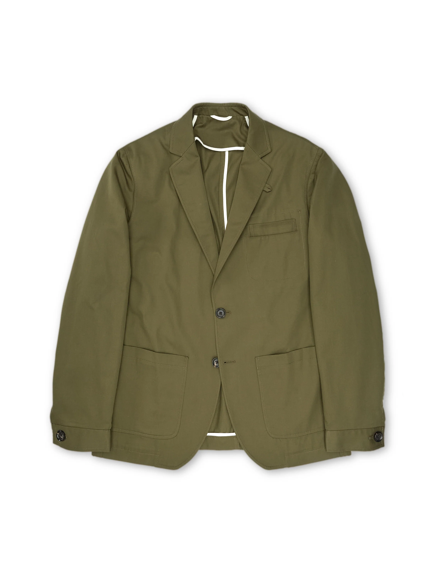
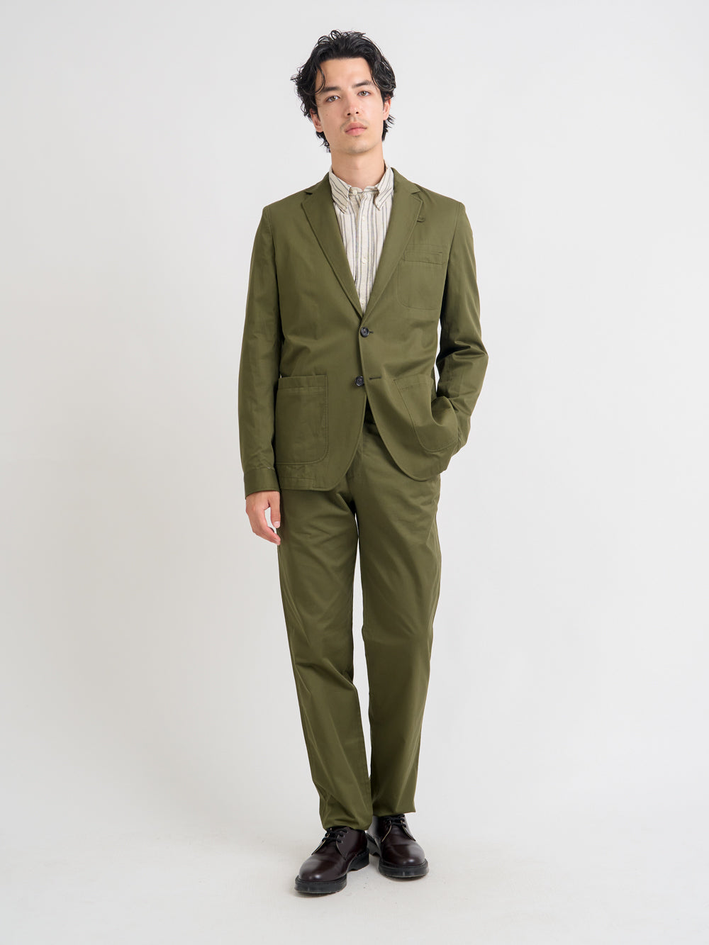
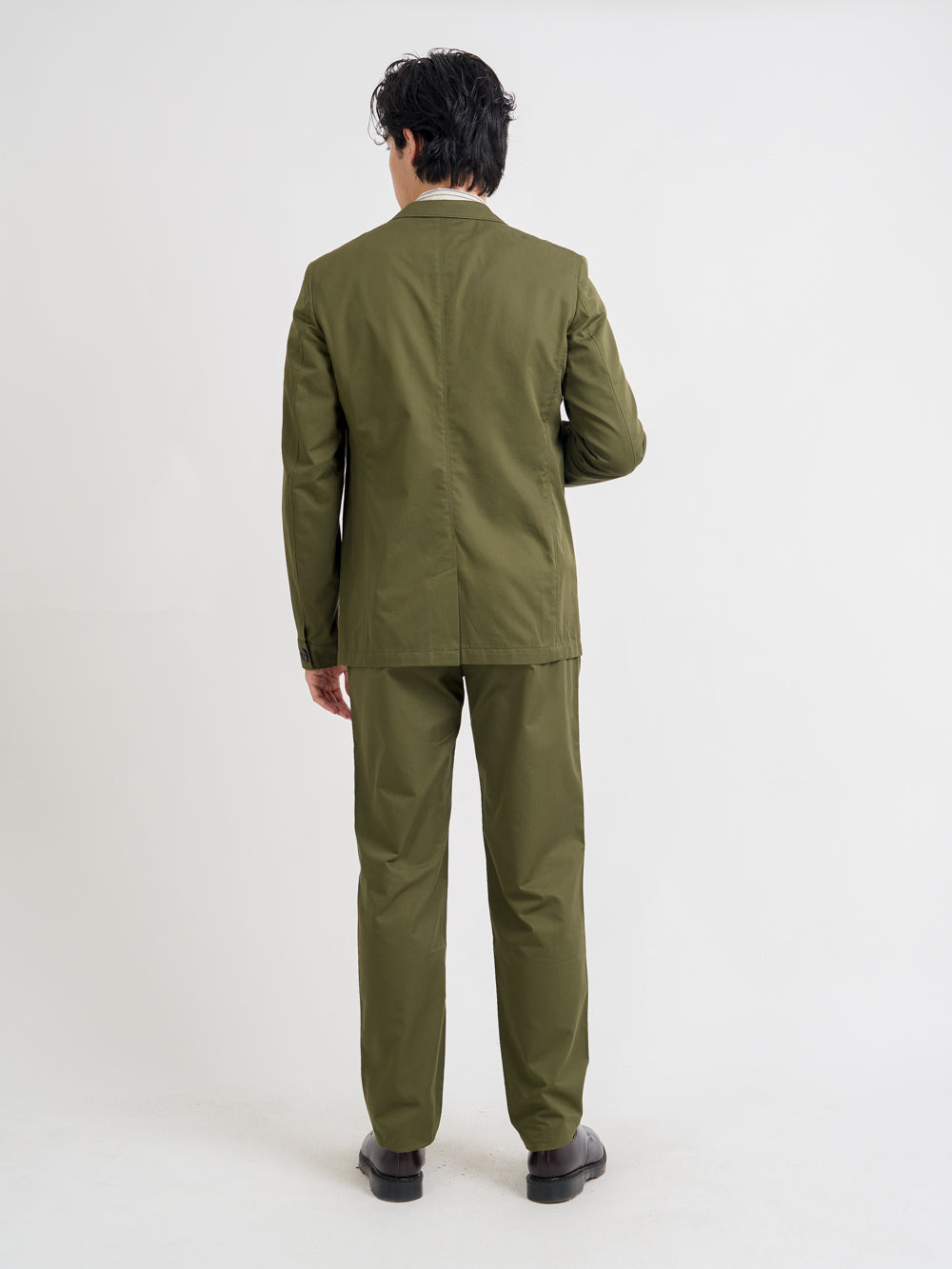
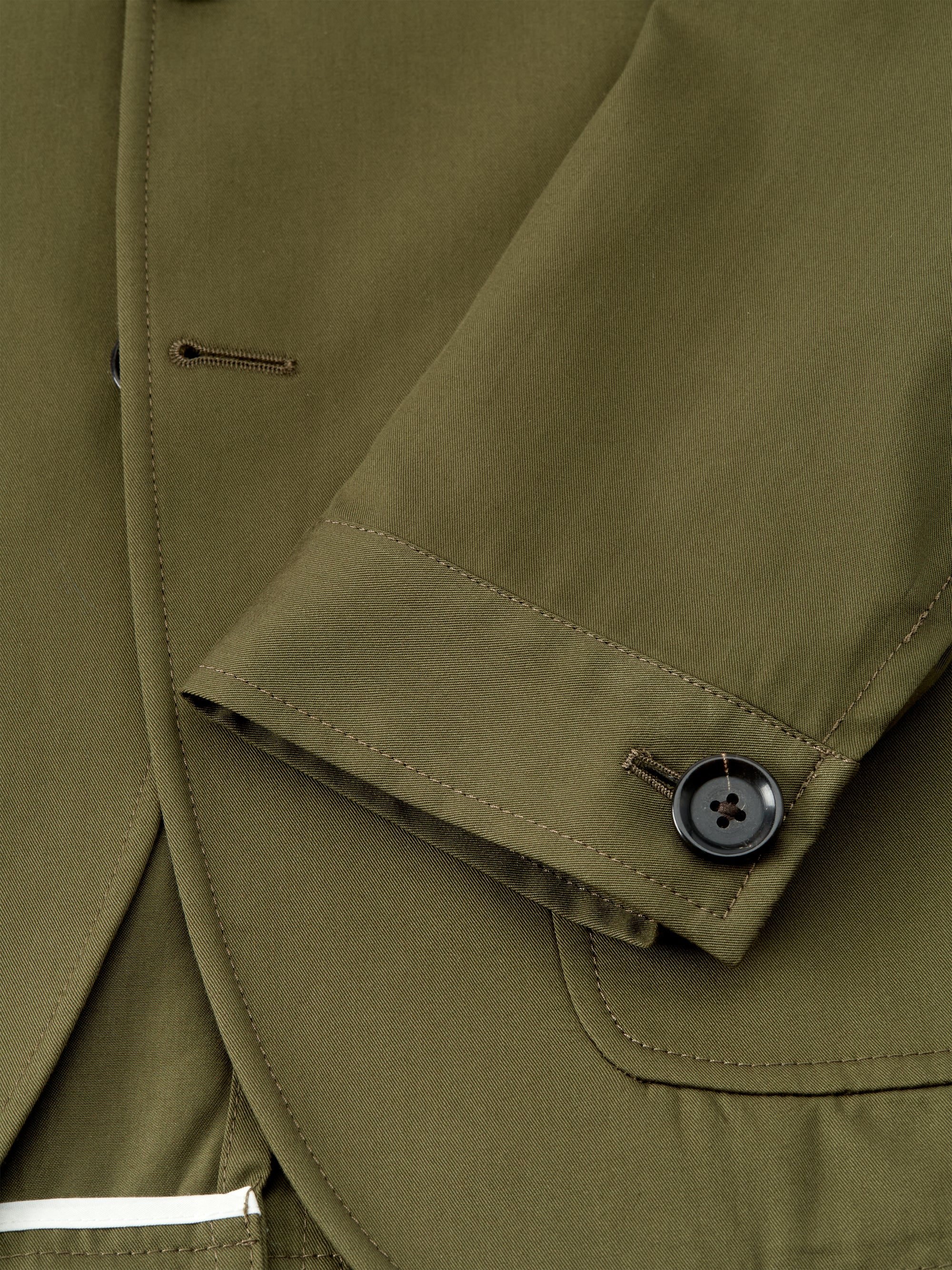
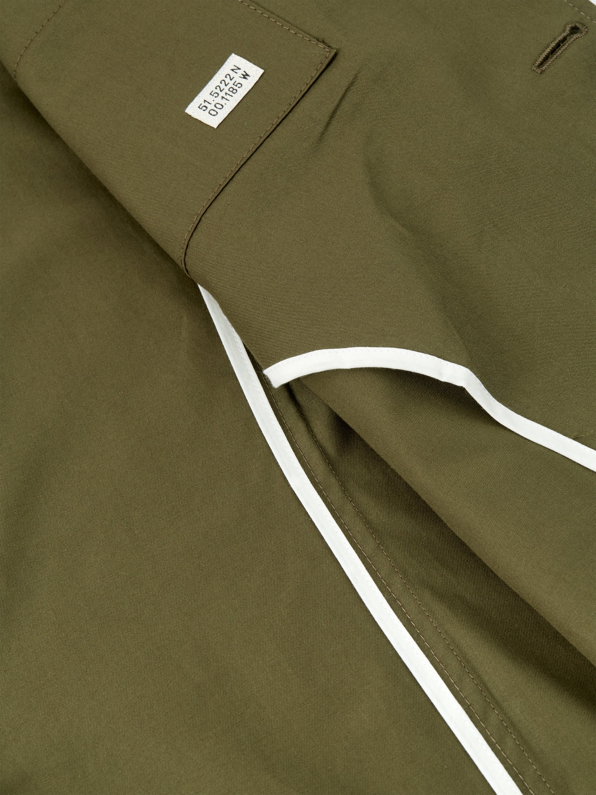
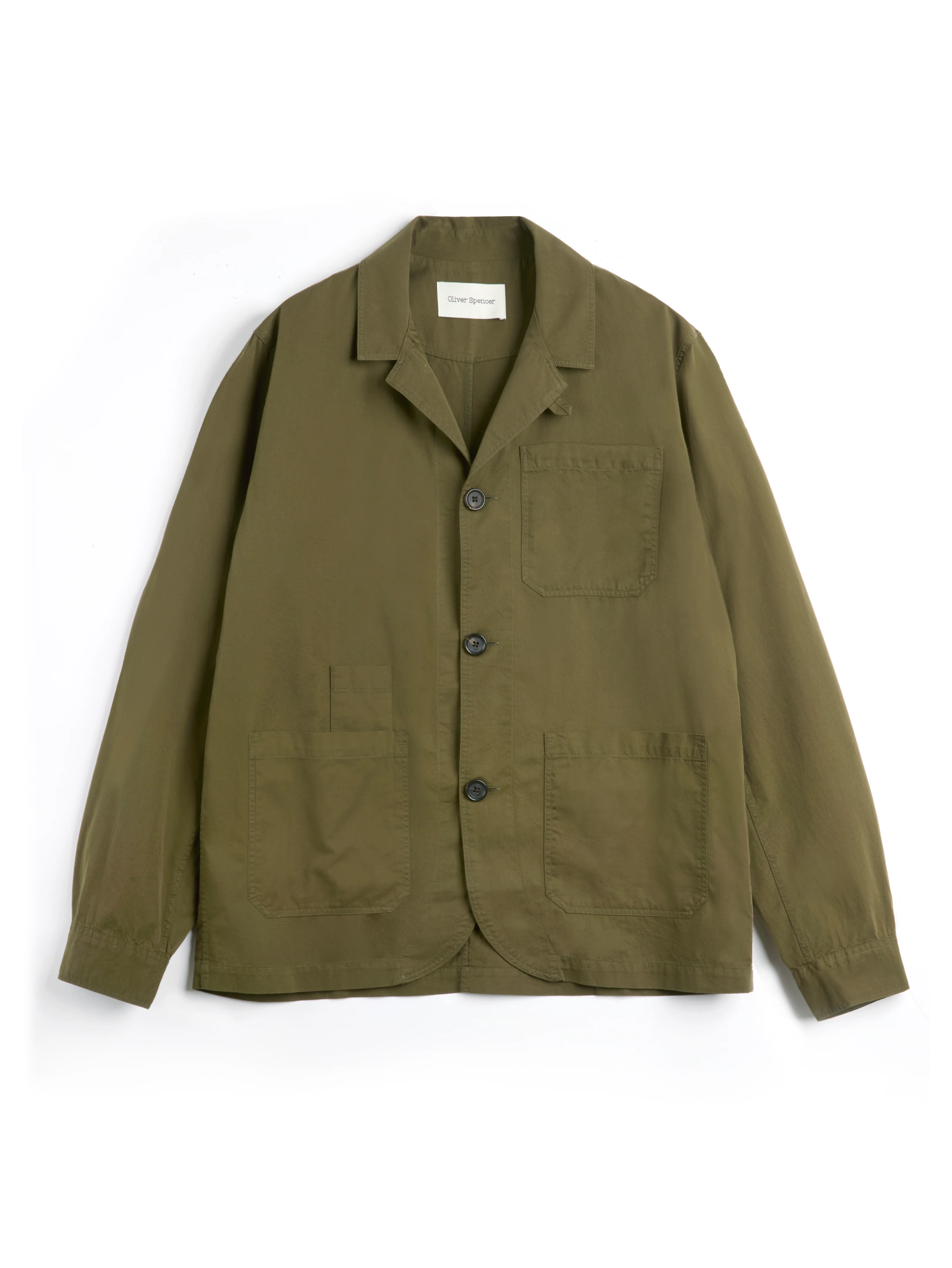
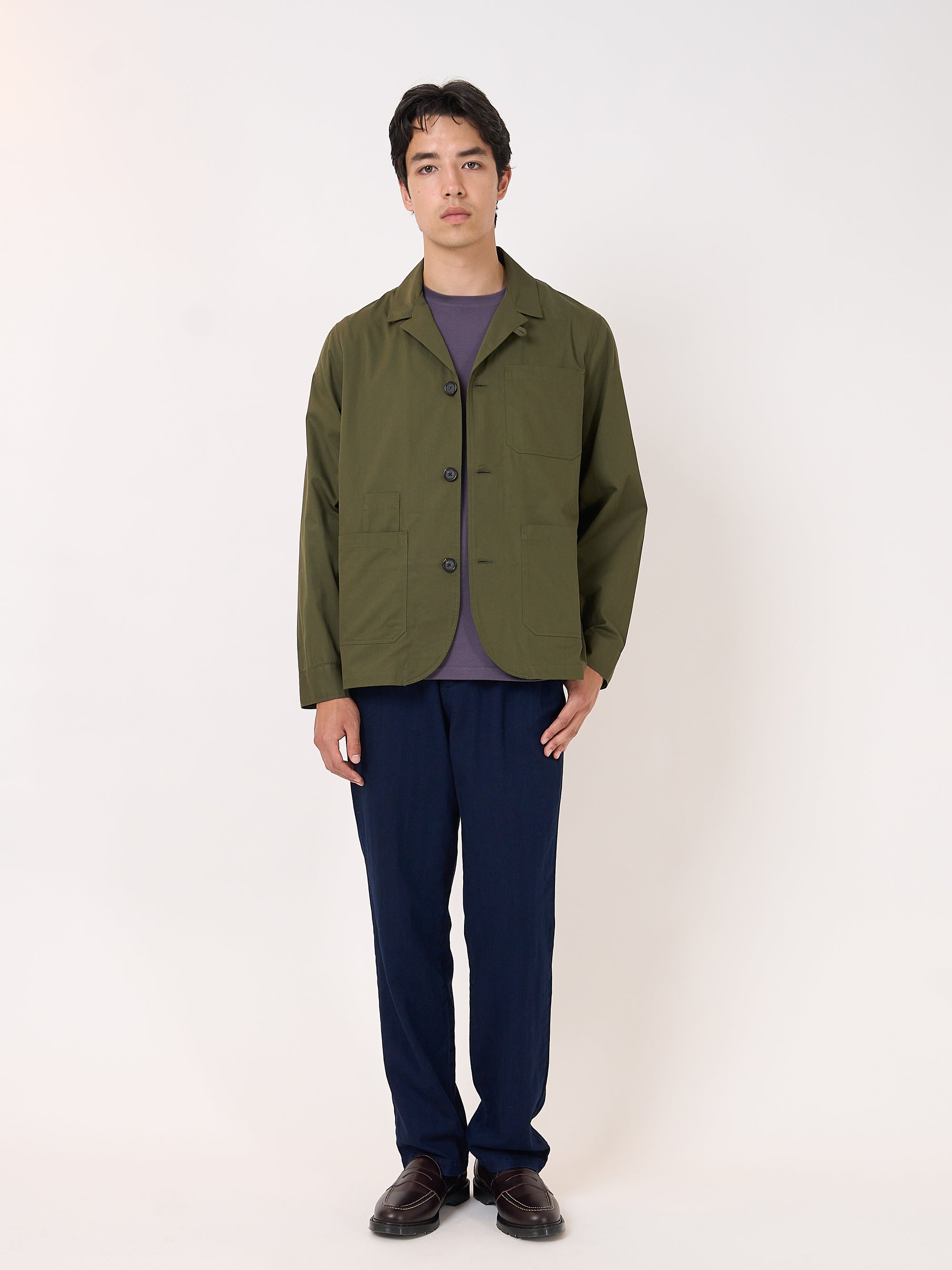
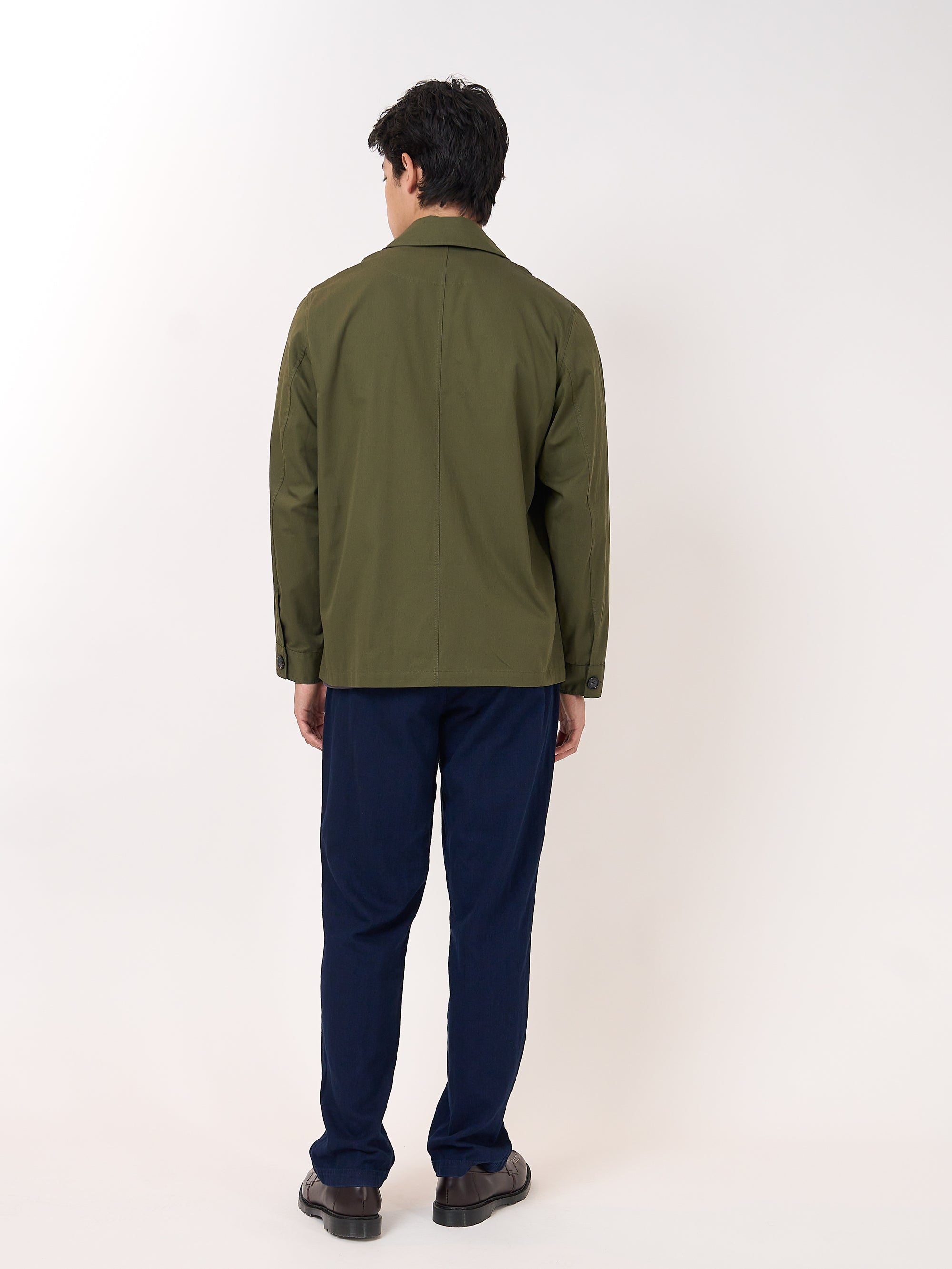
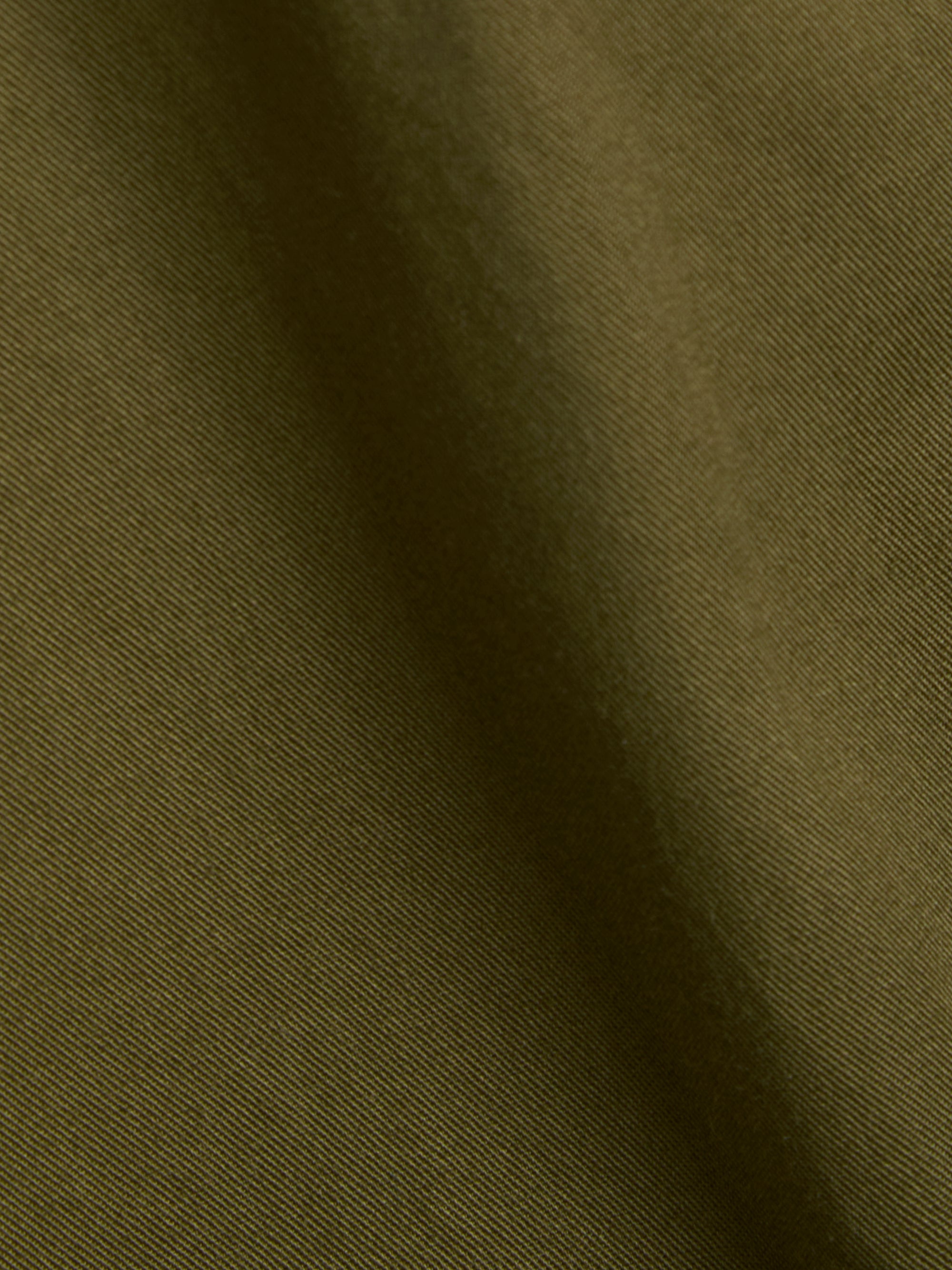
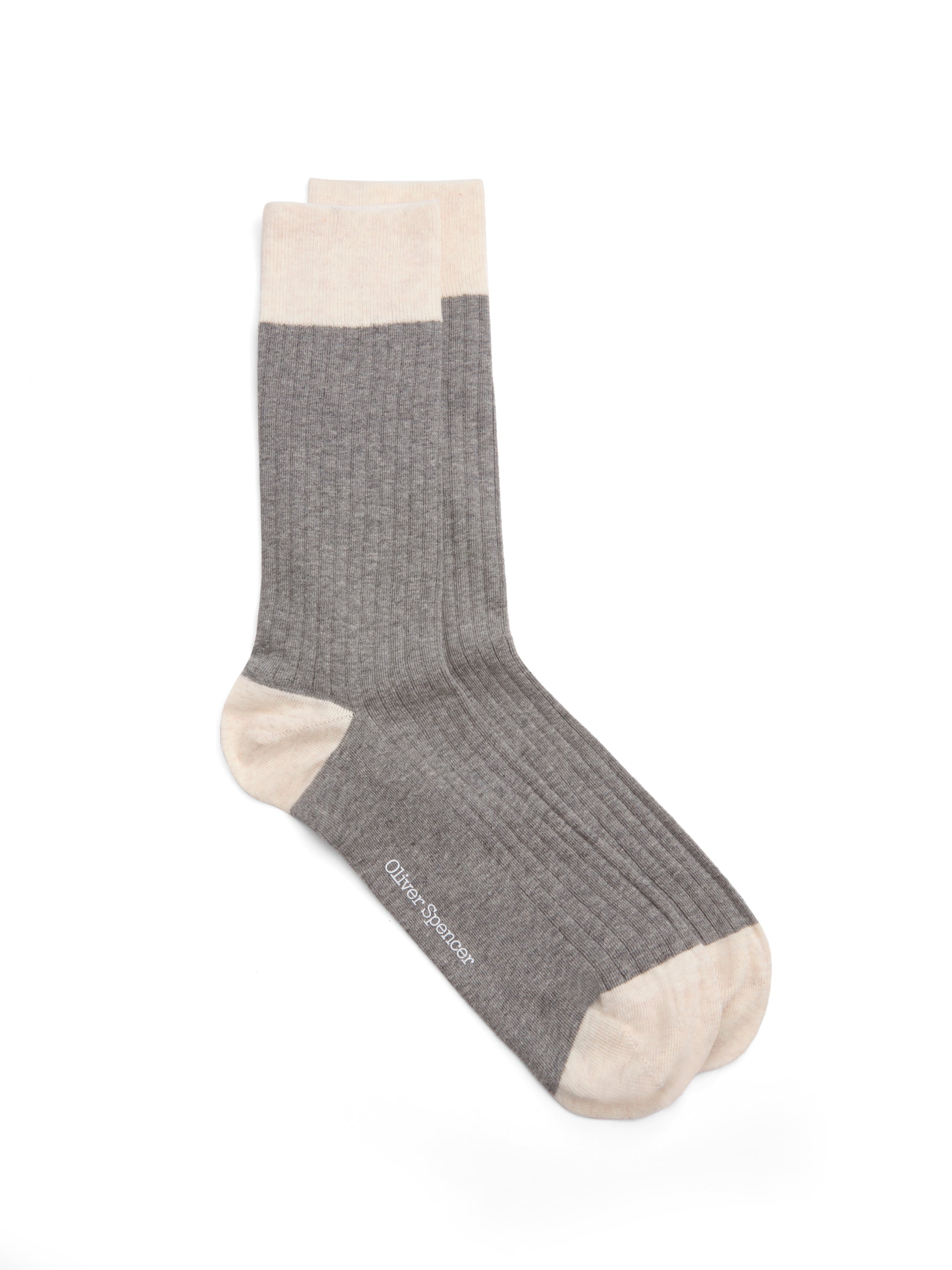
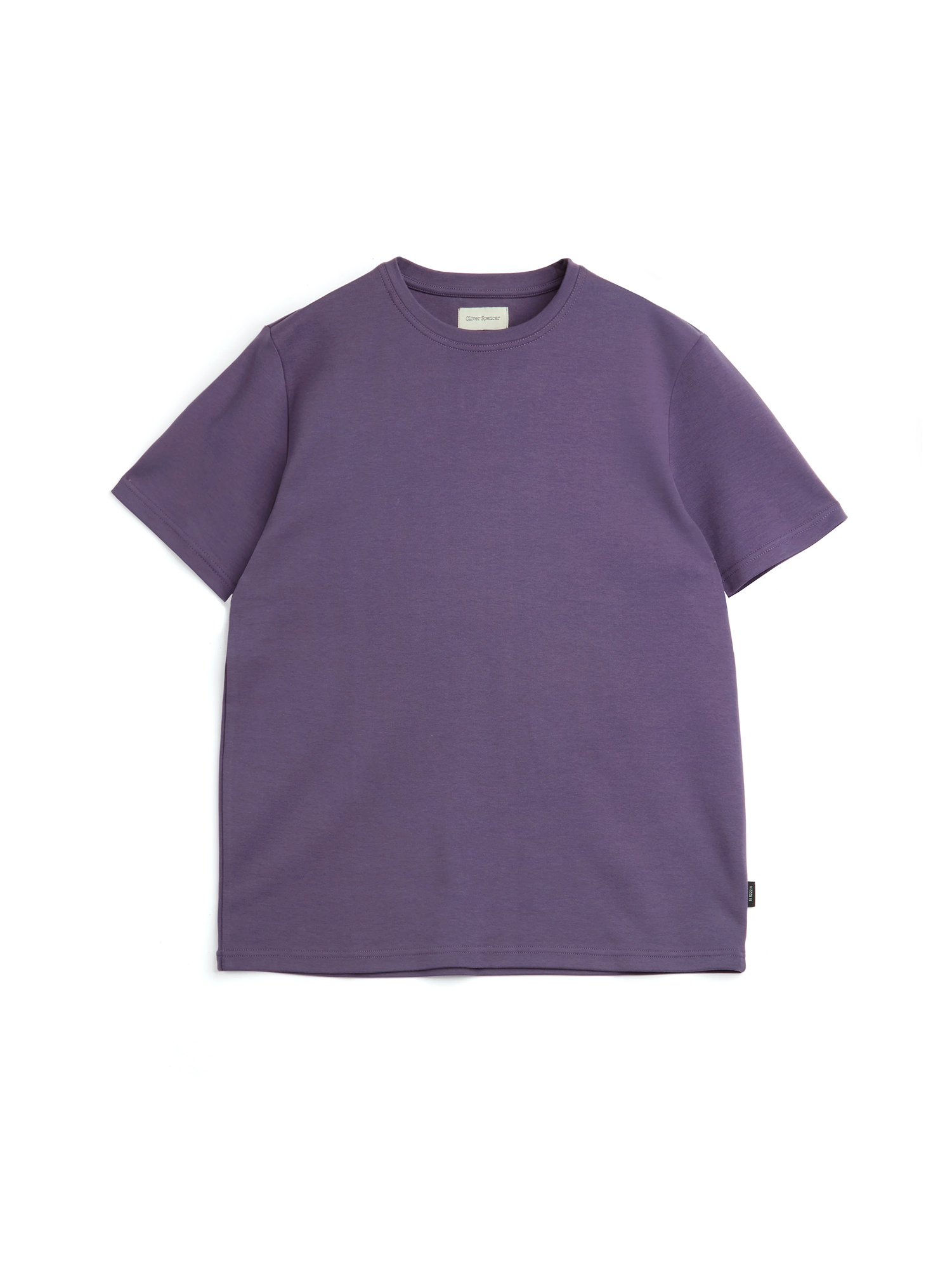
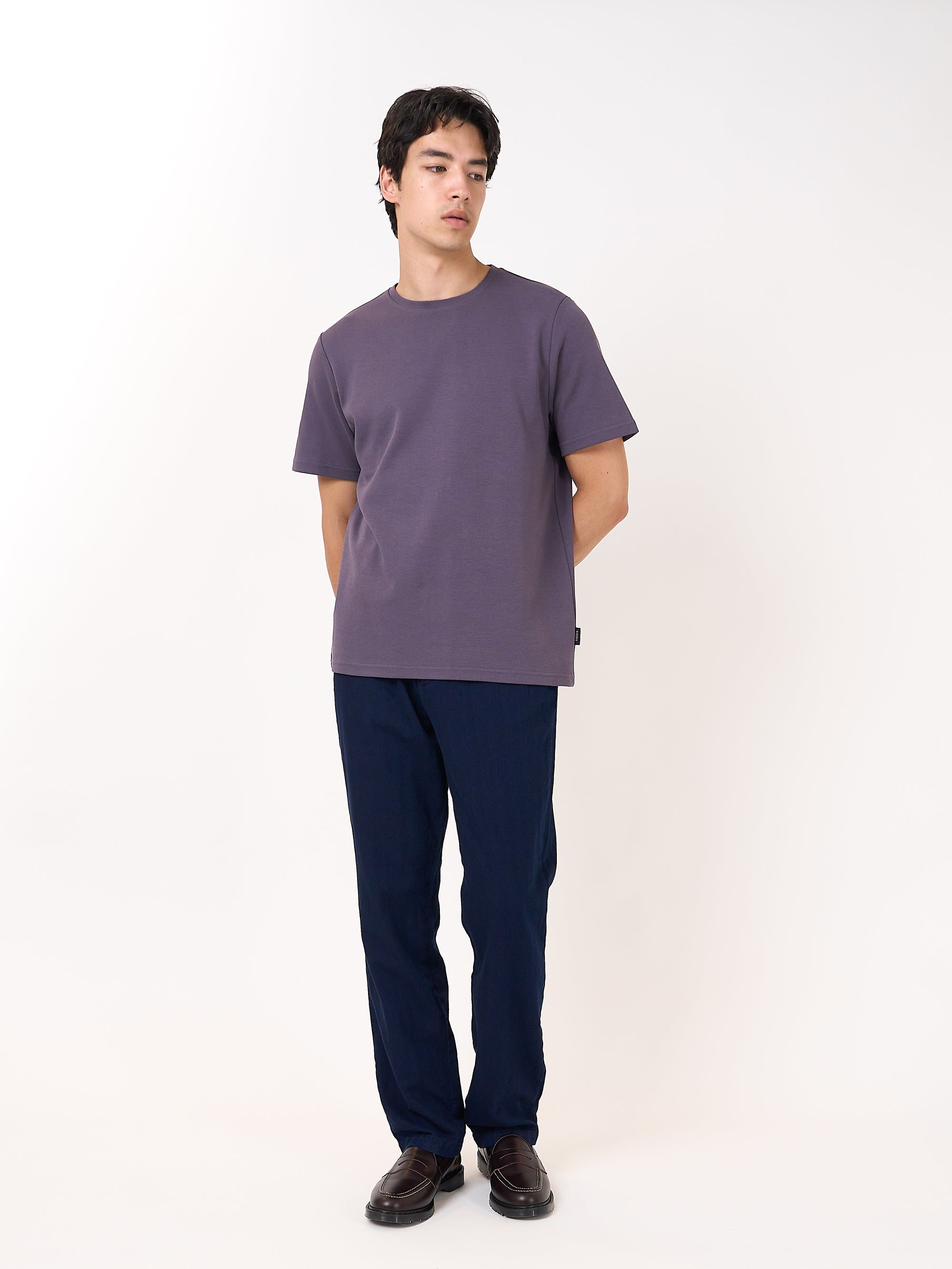
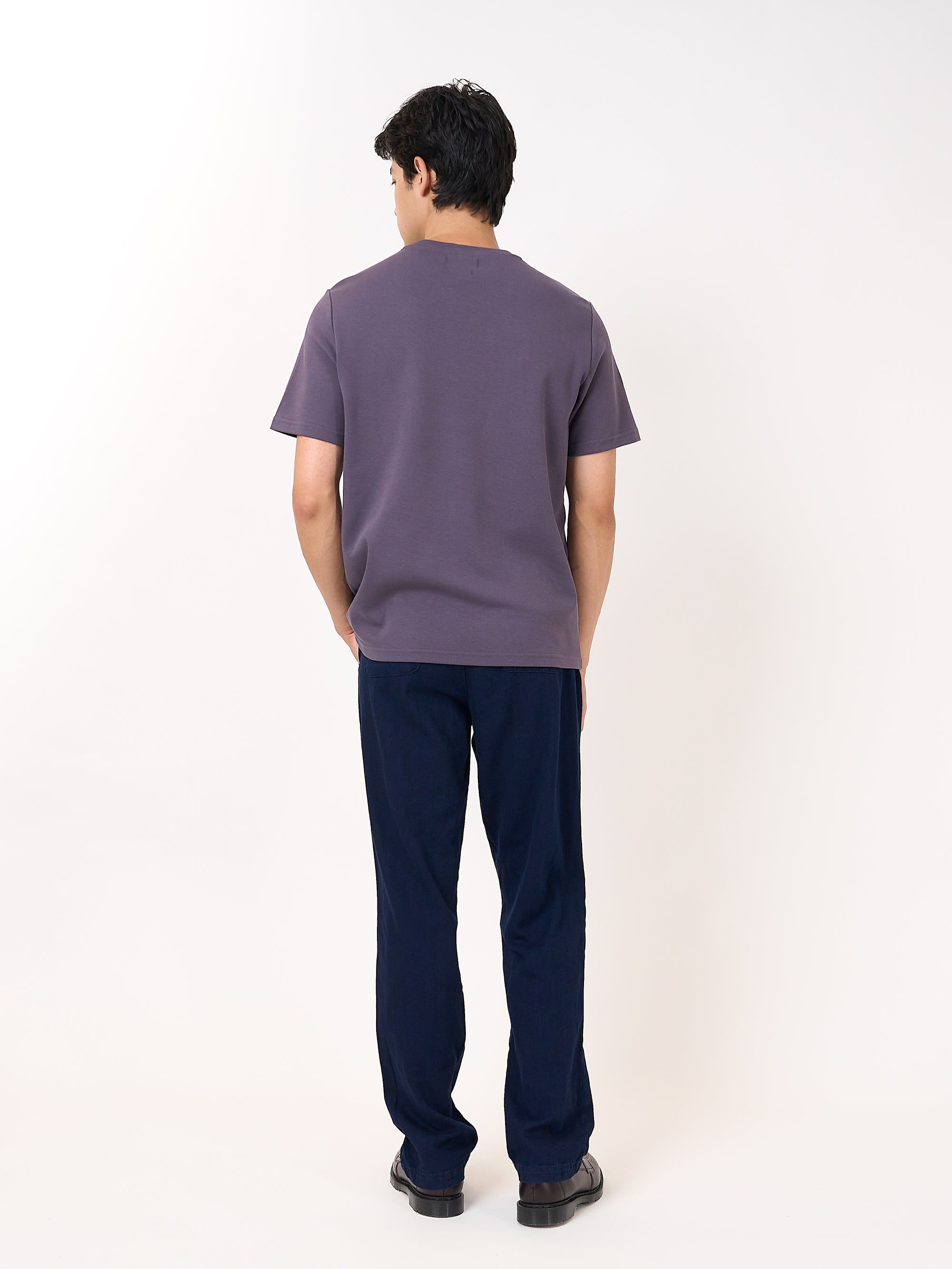
Colour is the most obvious lever to pull when thinking about styling your outfits, and it's the place that most people start when looking into their wardrobe in the morning. Whether you're angling for a monochrome fit that plays with tonality, or you're looking to clash every hue in the rainbow, colour is a really effective tool to help you say what you want to say with your outfit.

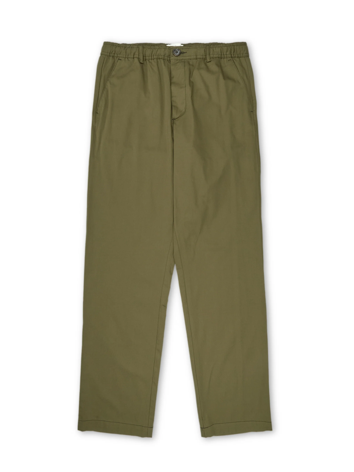
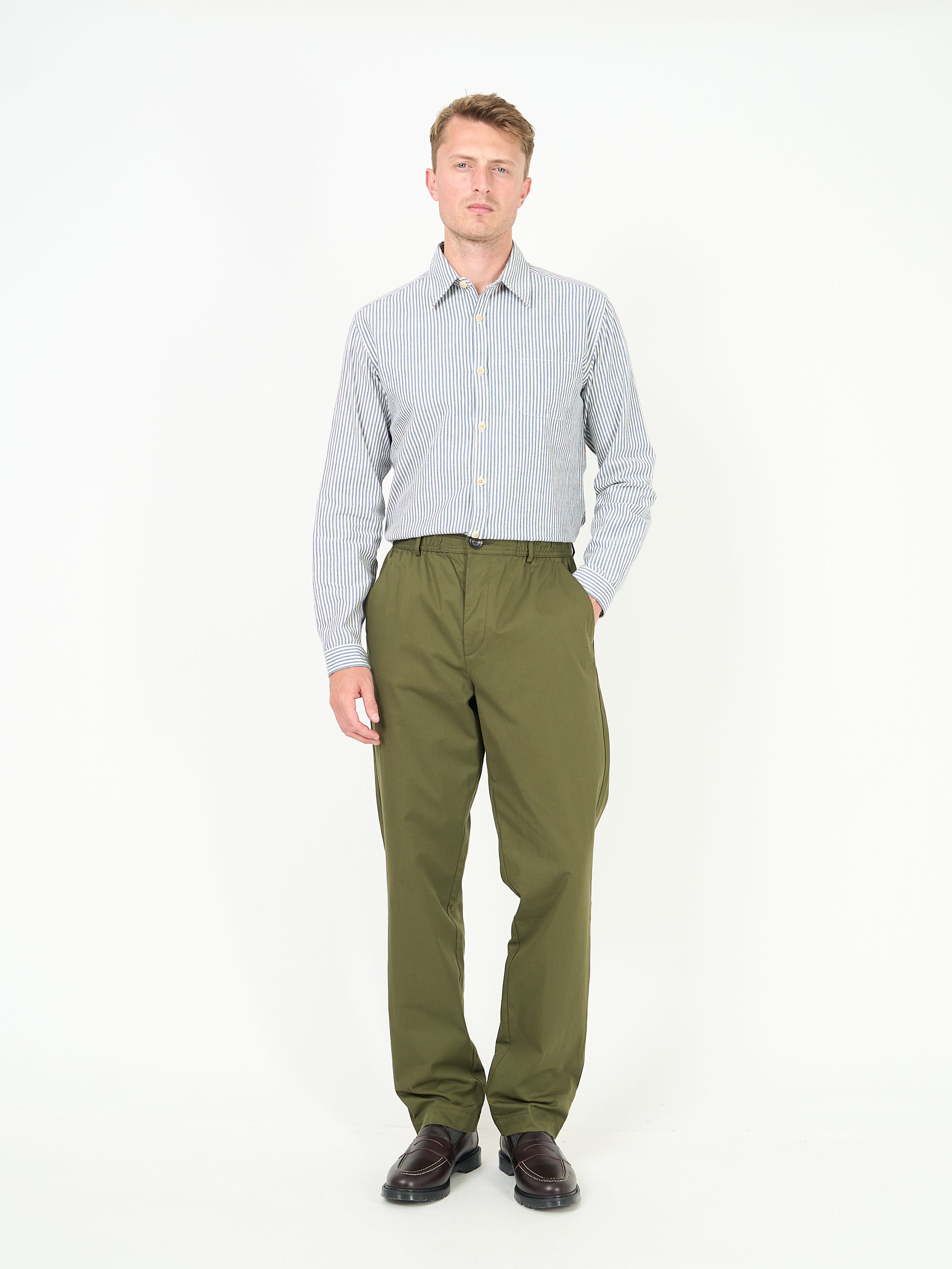
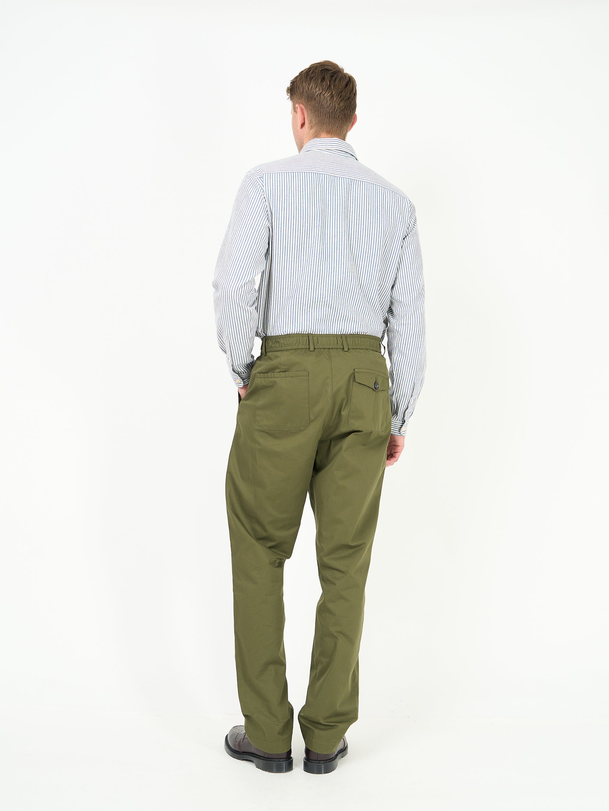
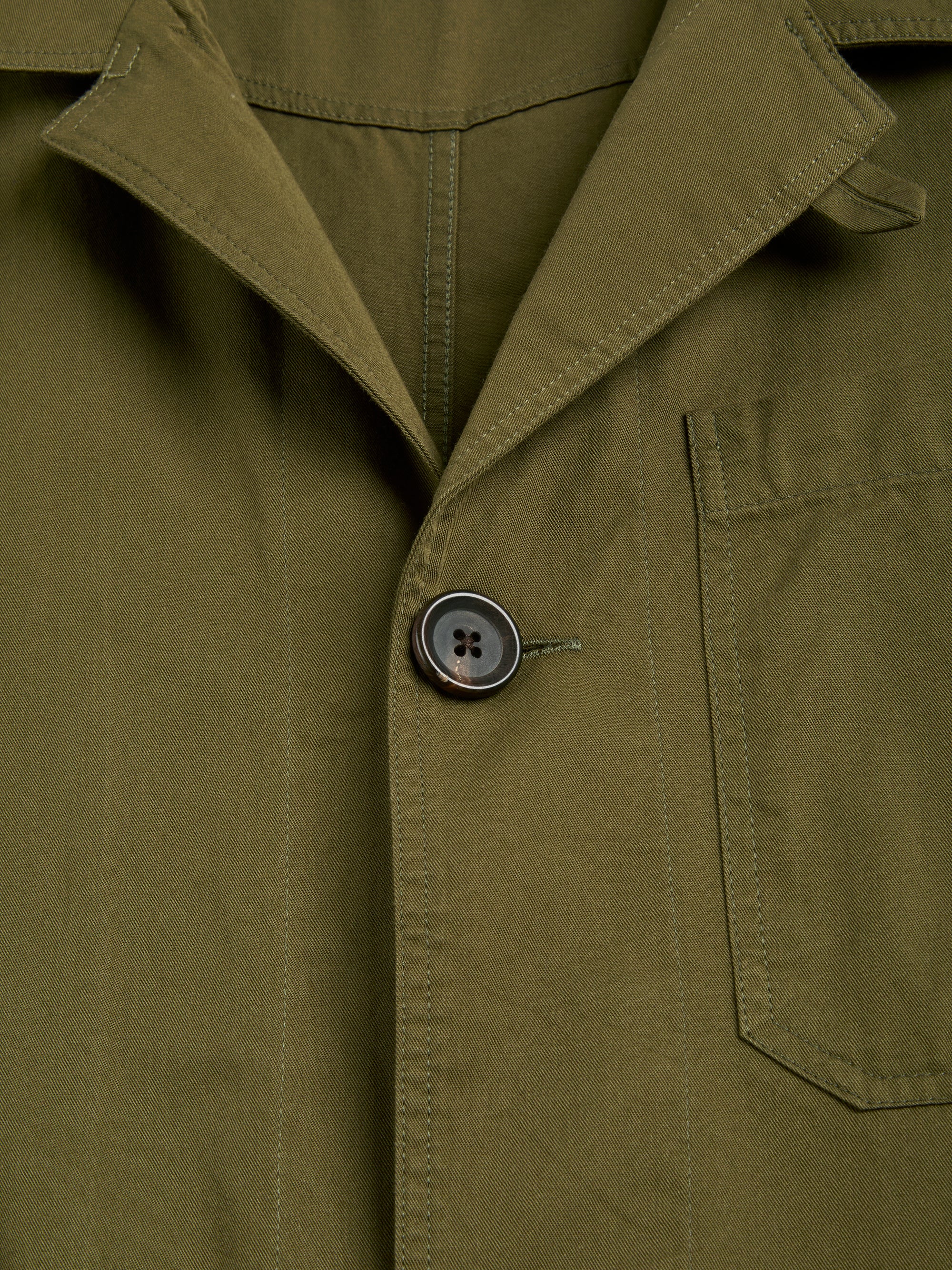
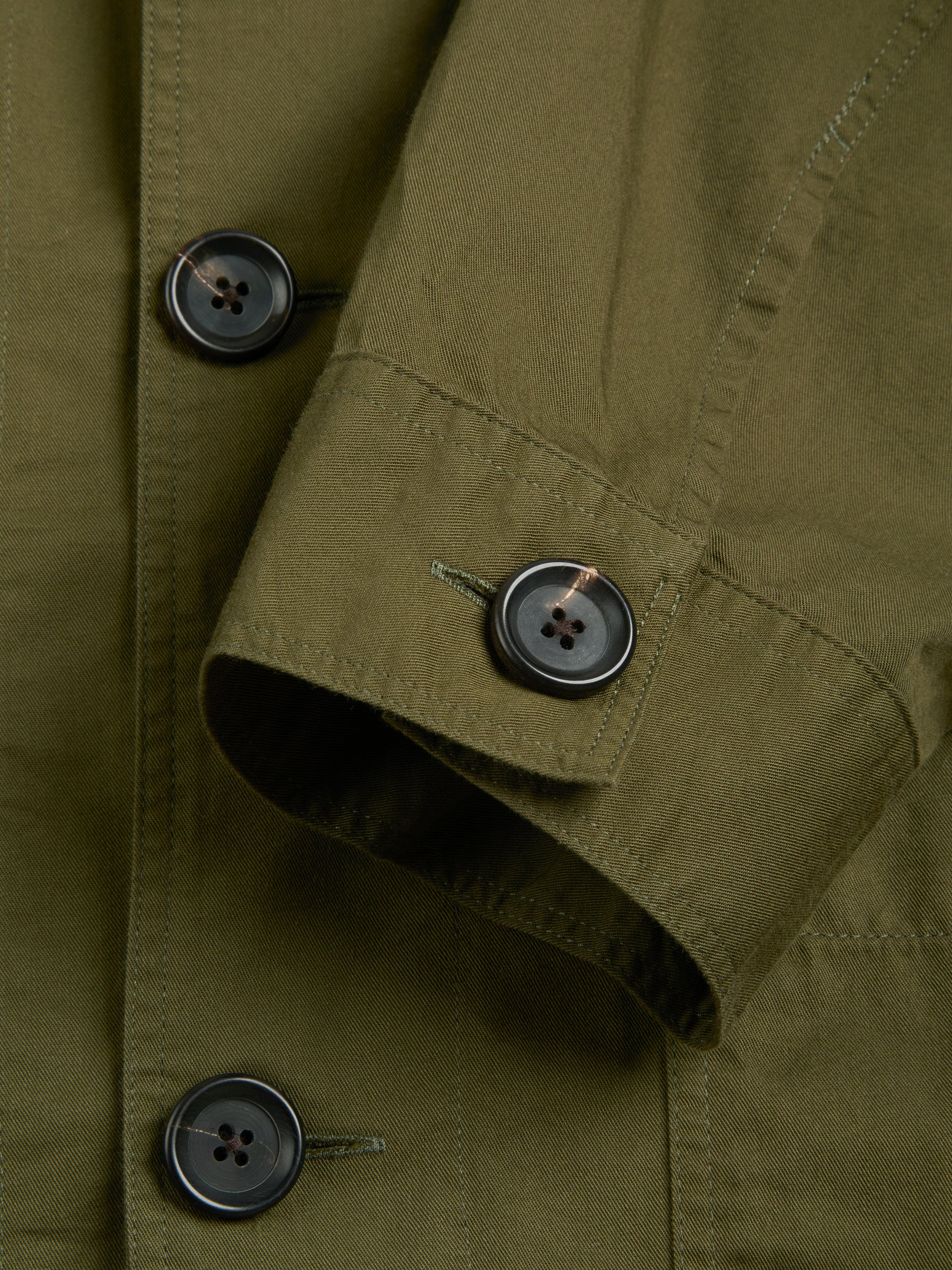
And while a pop or flash of a bold tone can be just what your look needs to come alive, colour can also be fickle and easily overused - just ask 1980s fitness instructors. At Oliver Spencer, we view colour through a slightly different lens. We're of the mindset that bold doesn't have to mean bright. One can still achieve really sophisticated looks by sticking to a restrictive palette of neutral tones that you can complement with contrasting accents of more vibrant colours. Having a canvas of understated hues - invariably in textural fabrics - gives you a great base to embellish with brighter colours if you want to.
The best place to look for colour palette inspiration is right outside, which is why our autumn collection is very much representative of the colours of the season. We've highlighted below the key tones that we've used this year, and quizzed Oli about his inspirations and references.
Brown
Key tones: Chocolate, tan, tobacco, ginger
Brown tones are our favourite new base colour this year, and we've gone with a rich array of hues to bring depth and warmth to your looks. Brown tones are especially effective when deployed across knitwear as the wool texture seems to bring out the best of the colour. It can also be used as an accent in the form of lighter shades such as tobacco and even ginger (which you'll find in some of our check pieces throughout the collection). Being a neutral tone, it styles really easily with almost any other colour, but we particularly like to wear it with green and navy shades for a rich earthy palette.
"I was really inspired by looking at old 1970s lookbooks and interior design images. Brown was everywhere and in some many different guises, tones, and patterns. So I've played around with different tones, from chocolate to tobacco, and the result is a really warm aesthetic."

Blue
Key Tones: Navy, indigo, sky blue
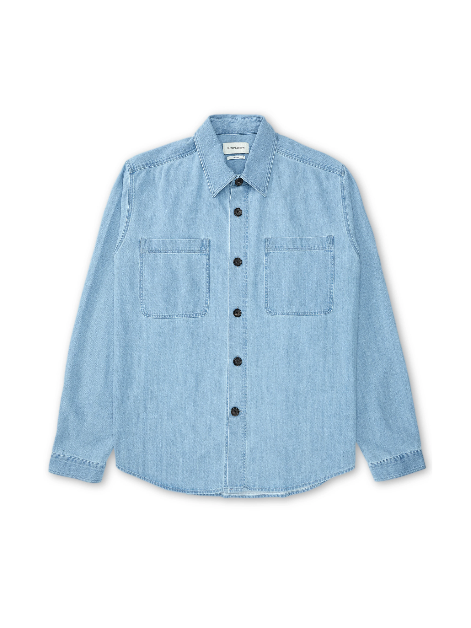
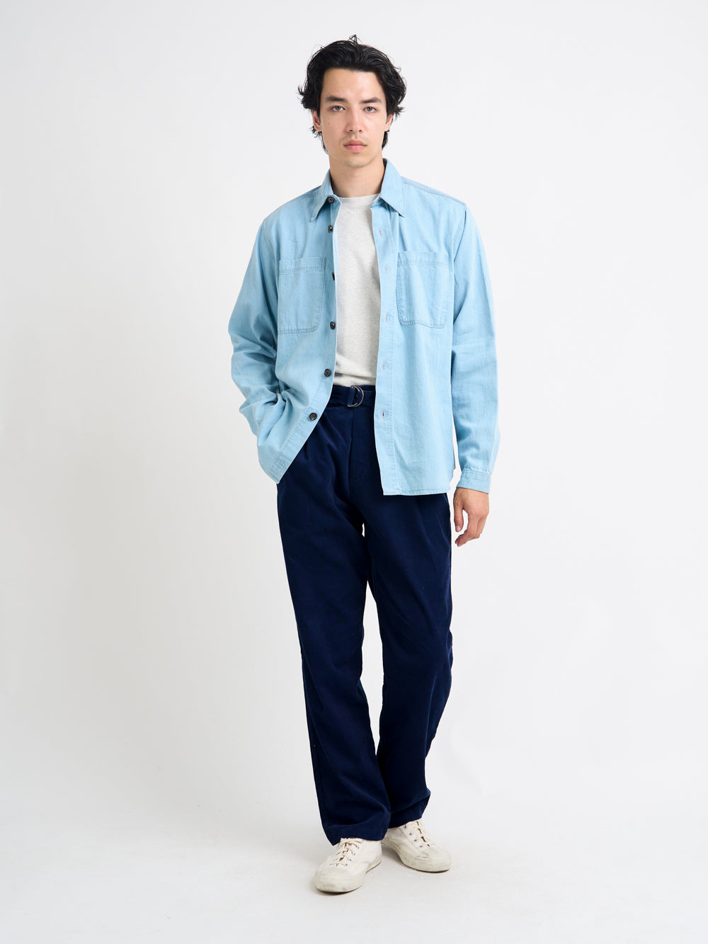
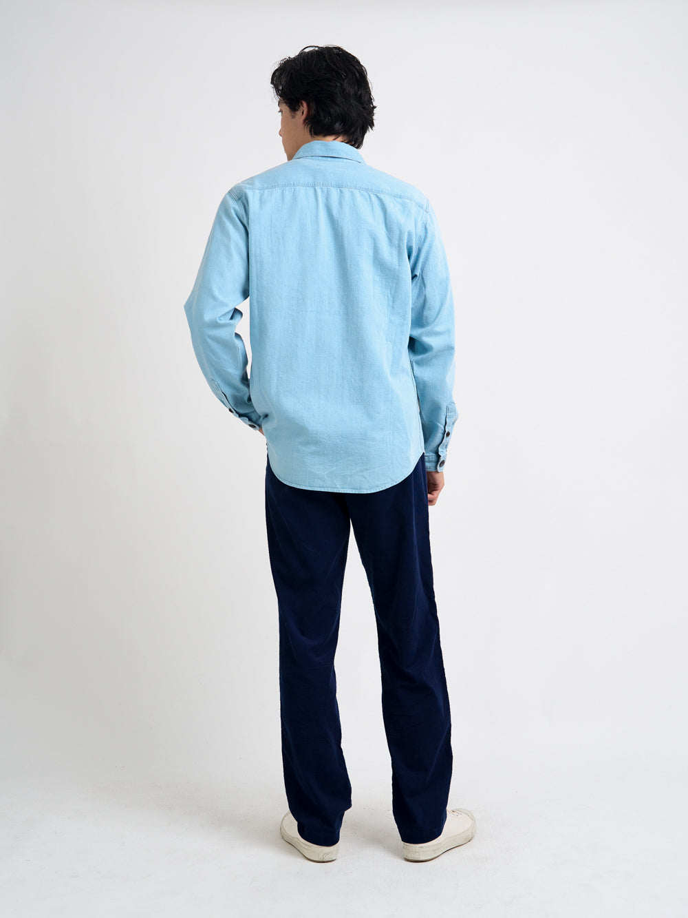
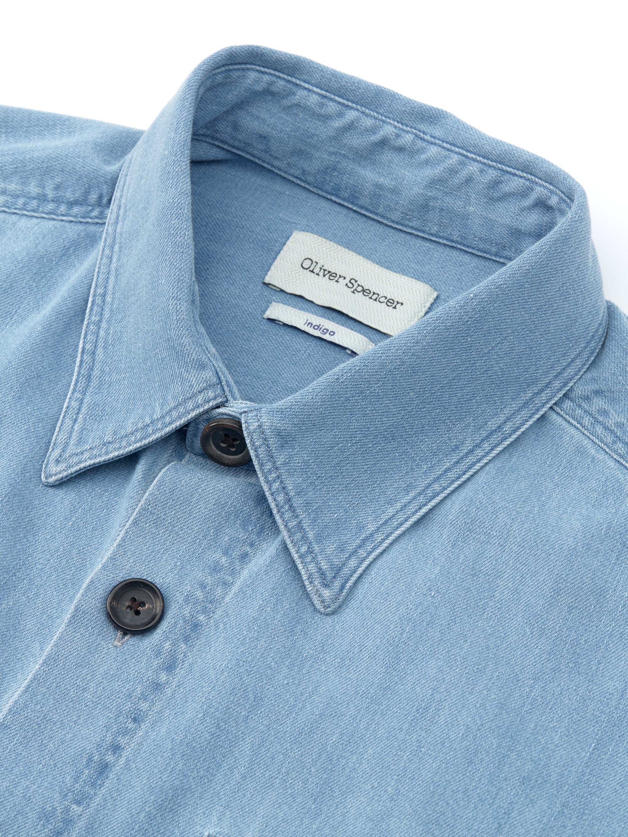
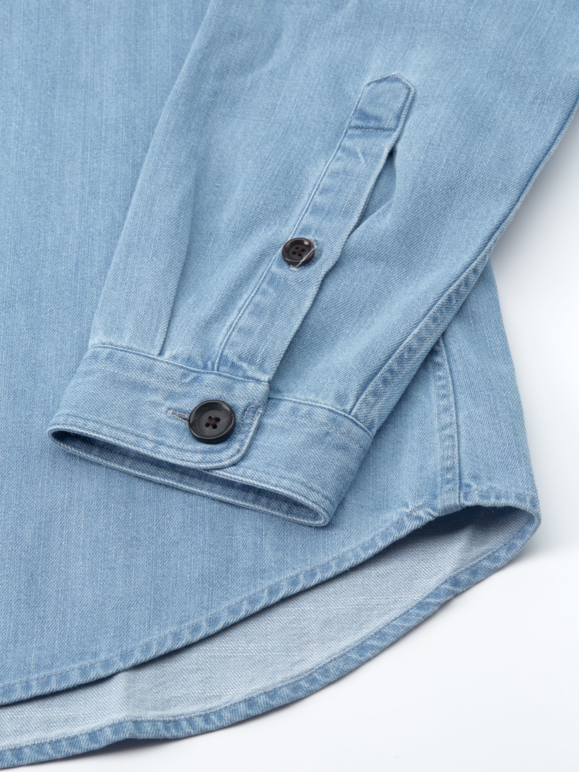
Blue is always at the core of most men's wardrobes for the simple fact that it is elegant and easy to wear regardless of the tone. Navy is the obvious go-to for the autumn and winter months, being a colour with depth and authority, and one that can take accents of bright hues really well (useful when thinking about shirt/tie options with a navy suit for example). Indigo-dyed cottons are brilliant too, providing a lighter colour with lots of tonal nuances in the fabric. Opting for tonal blue looks, that is, combining different shades of blue to create a monochromatic outfit is a great styling option that's easy and quick to pull together. If you are going to go top-to-toe blue or even navy, just be sure to mix up your textures to prevent the outfit looking flat.
"Let's face, we all take blue for granted. It has been such a stalwart in menswear that it's part of the style furniture, especially navy, which has become the de facto 'smart' colour. This season I wanted to highlight the dexterity of navy and lighter tones by combining it with interesting textures like wool, and indigo-dyed denim."

